
Design language
Logo
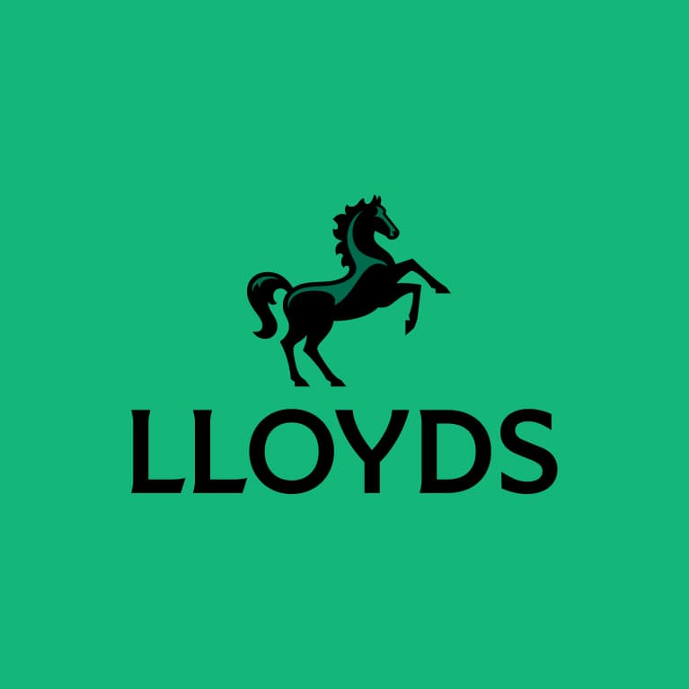
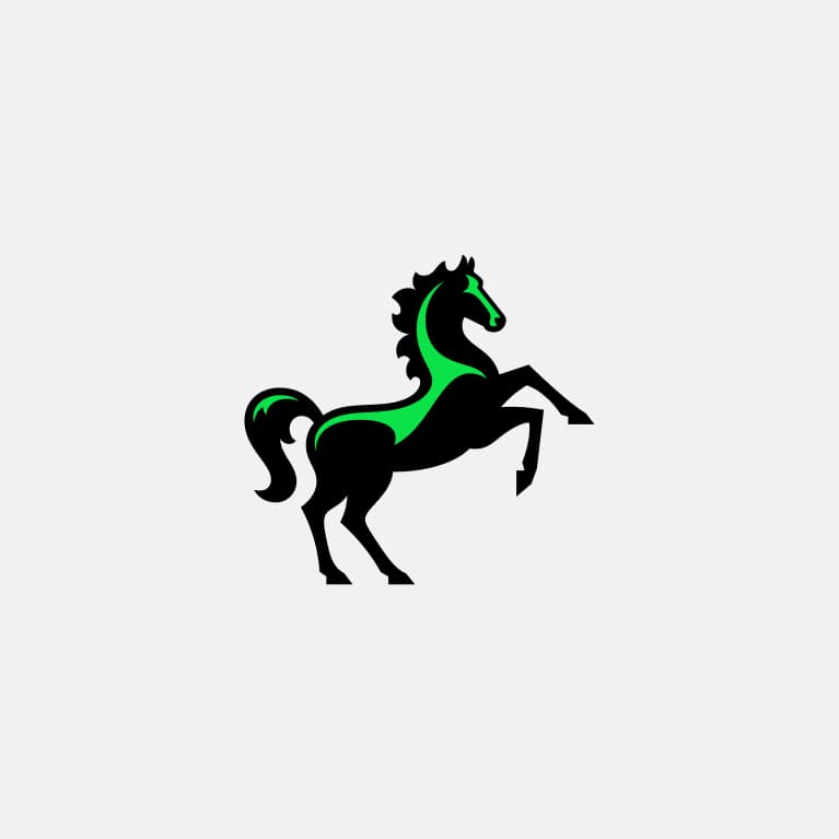
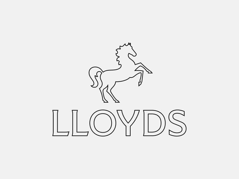
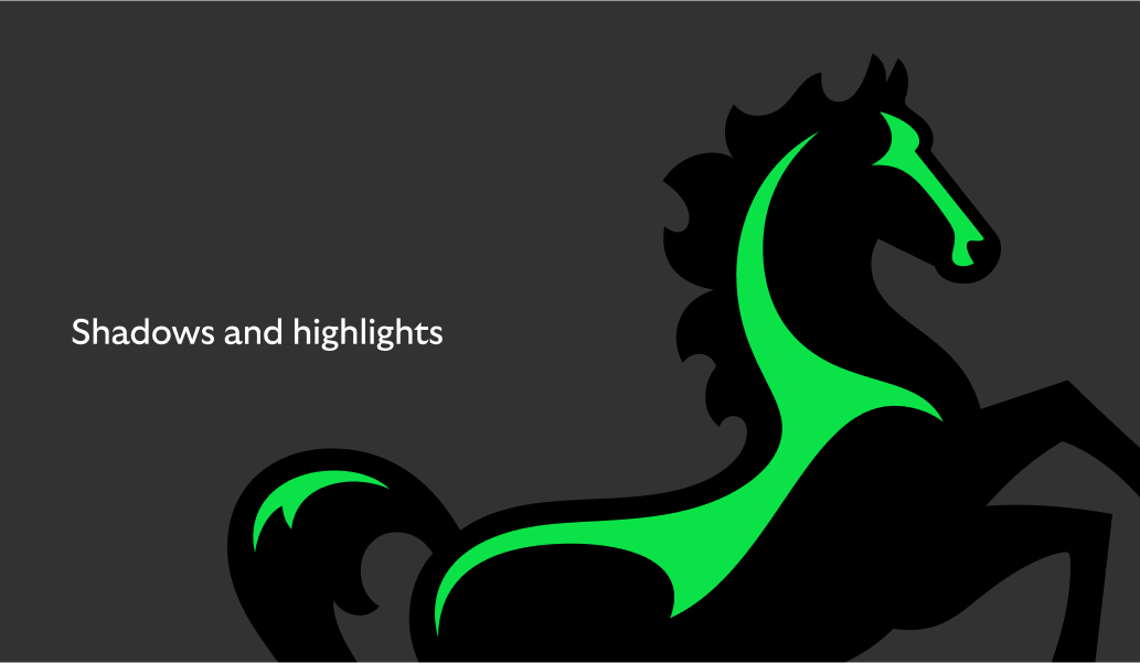
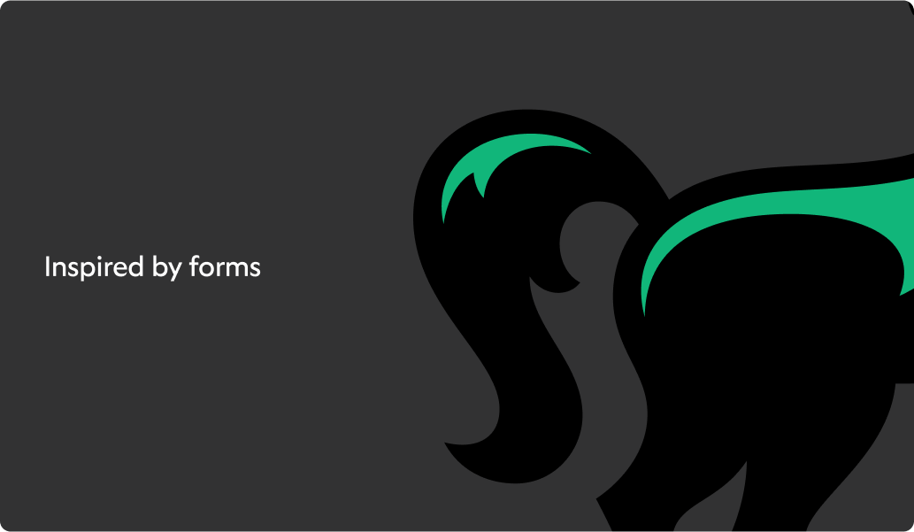
Timeless and iconic
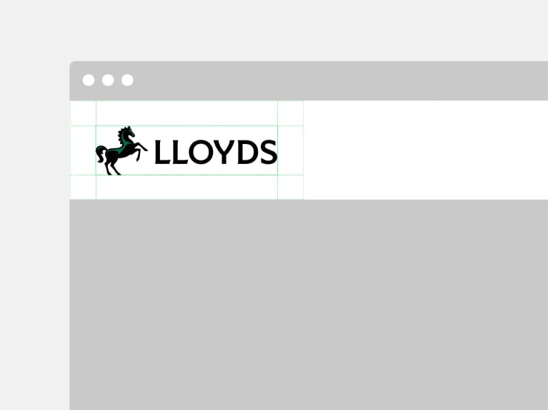
This is our logo. It combines our wordmark with our iconic black horse symbol ‘Cancara’. It takes the best of our heritage and modernises it for the future. Forward facing, crafted with charm and full of momentum.
Our logo suite
To ensure our brand is always clear and distinctive,
we have a suite of logos for different formats.
For consistency, we always use pre-created logo assets.
Visit the ‘Our name’ section for guidance on how and when to use ‘Lloyds’ and ‘Lloyds Bank’.
Lloyds
Lloyds Bank
Cancara symbol
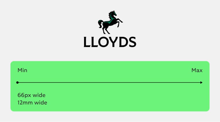
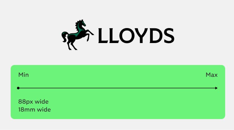
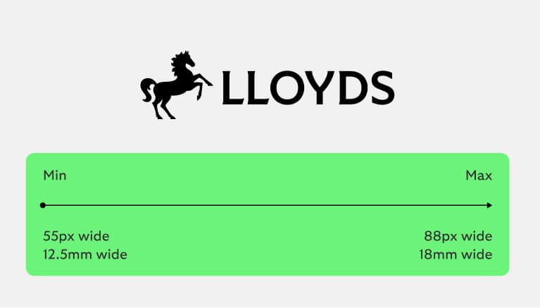
Lloyds
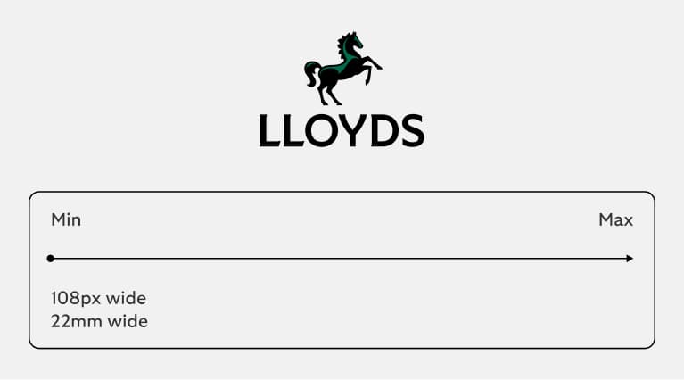
Primary logo
This is our primary logo and it’s what we lead with whenever possible.
Primary logo positive
We use our logo proudly and clearly.
Primary logo small use
Optimised to be legible for small sizes.
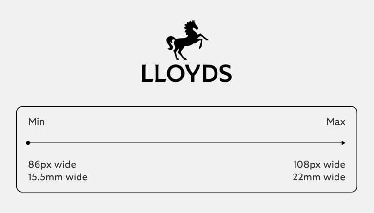
Secondary logo
Visit the ‘Our name’ section for guidance on how and when to use ‘Lloyds’ and ‘Lloyds Bank’.
Secondary logo positive
We use this when space is limited.
Secondary logo small use
Optimised to be legible for small sizes.
Lloyds Bank
Primary logo
This is our primary logo and it’s what we lead with whenever possible.
Primary logo positive
We use our logo proudly and clearly.
Primary logo small use
Optimised to be legible for small sizes.
Secondary logo
To ensure the legibility of our logo, we also have
a horizontal secondary logo to allow the brand to
adapt to different size formats.
Secondary logo positive
We use this when space is limited.
Secondary logo small use
Optimised to be legible for small sizes.
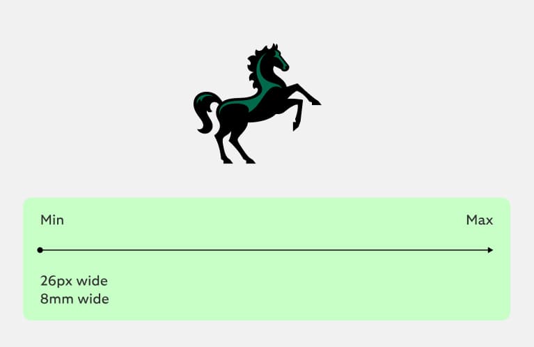
Cancara symbol
The Cancara symbol is iconic to our customers. It’s forward facing, crafted with charm and full of momentum. We use it in smaller spaces where there is not enough space for our primary or secondary logos, ensuring that wherever we are, we're distinctively Lloyds.
Cancara symbol positive
We use this proudly and confidently, for expressive or responsive applications.
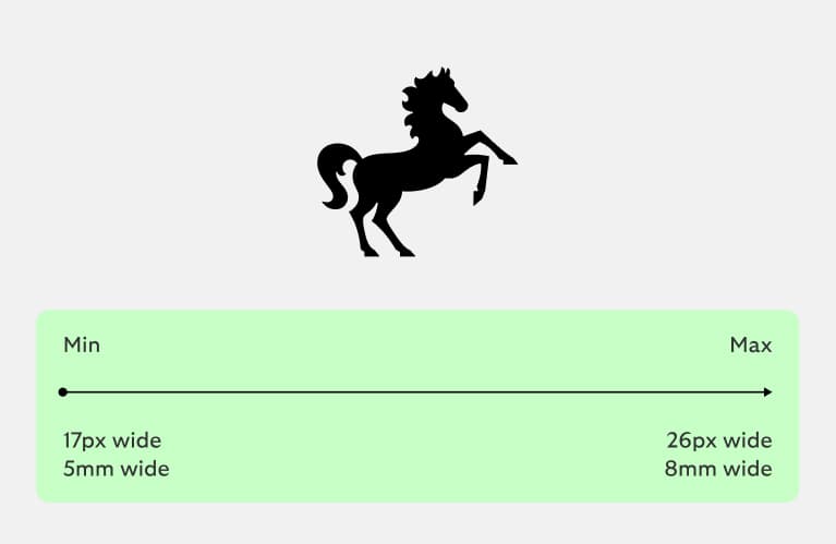
Cancara symbol small use
Optimised to be legible at small sizes.
Using our Cancara symbol
We use our Cancara symbol with confidence to signify the brand. We can use it on its own when the Lloyds brand is present to ensure brand attribution, e.g. social media or in store.
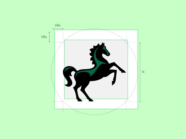
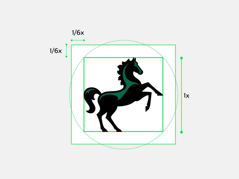
Clear space
To allow the symbol to be used as large as possible in small containers, the clear space around the symbol is 1/6 the height of Cancara.
Circular containers are defined by the inner square.
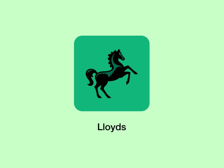
App icon
Social
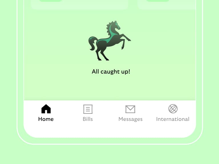
In-app moments
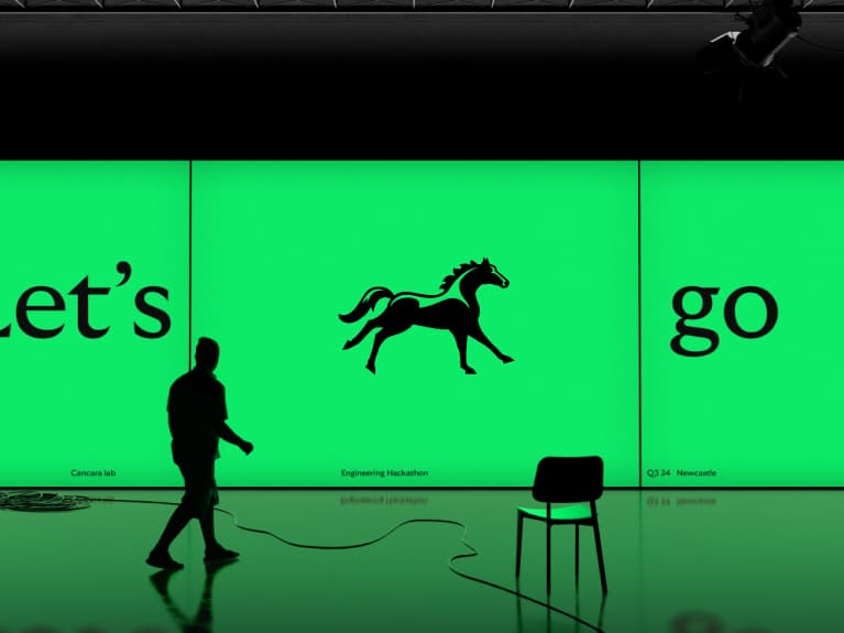
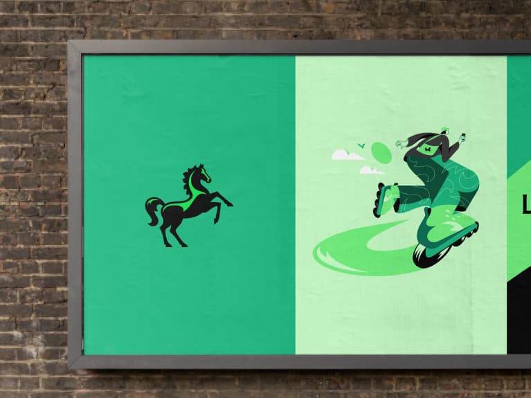
Expressive Cancara
We can also use our Cancara symbol as an expressive device. We can use it dial up the sense of modernity or to give our brand a more energetic feel. It should be reserved for expressive moments, like events.
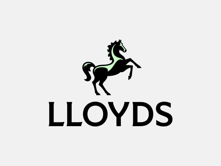
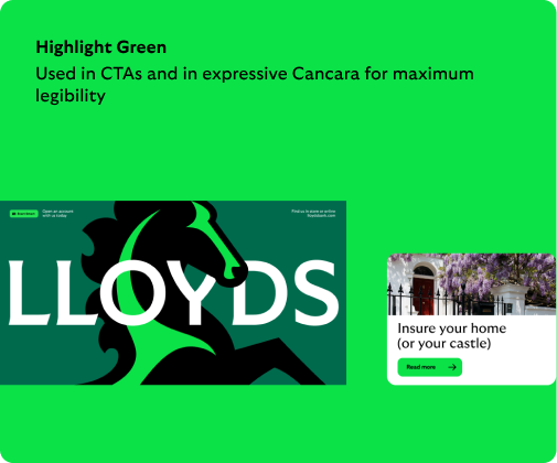
Colour: Highlight Green
Our expressive symbol uses Highlight Green as Cancara's highlight colour.
Prominence: focal point
When using expressive Cancara, it should be bold, prominent and draw attention.
Tech conference
We can use it to dial up the sense of innovation.
Student campaign
We can use it to give the brand a more youthful and energetic feel.
Logo background colour
Please see ‘Our name’ section where we define how and when you use ‘Lloyds’ and ‘Lloyds Bank’.
Primary colour way
Background: Everyday Green
Background: White
Background: Calm Green
Background: Vibrant Green
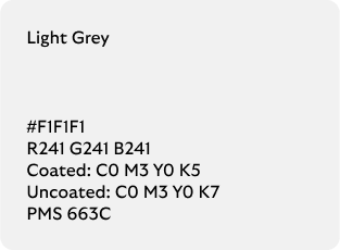
Background: Light Grey
Background: Light use of an image
Ensuring we use our positive logos
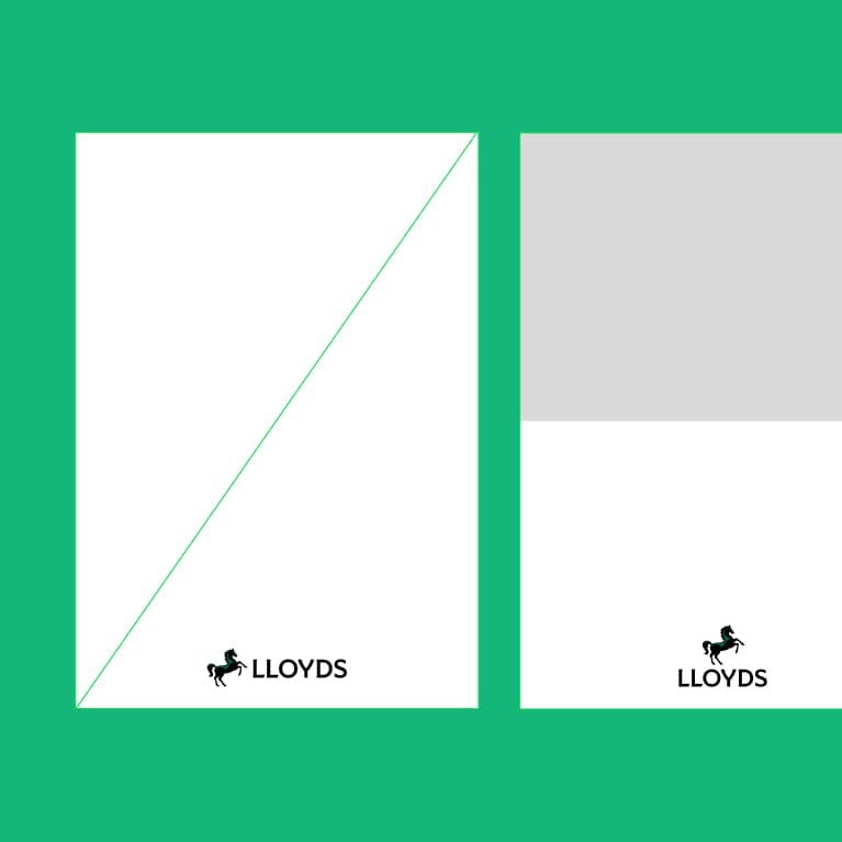
We use our positive primary logo whenever possible – this is how our customers know and recognise us. We select our assets and layouts to maximise the use of our primary logo, ensuring its legibility across our comms. Check out the layout section for more guidance on creating these.
The principles defined here also apply to Lloyds Bank.
Used on a light area of an image
Adjust the image crop to ensure the positive primary logo is legible.
Layouts that allow for logo on light background
We use our 50/50 layout principles to create a light background for our positive primary logo.
Used on light background
We prioritise using lighter tones to ensure our positive primary logo is always legible.
Reversed logo
Cancara is a black horse so it should be used positive wherever possible. However, we can use our reversed logos when we are unable to use the positive. We use
these logos to ensure legibility on images and dark backgrounds.
Small use logos are also available for our reversed logos.
Primary
Secondary
Cancara symbol
Primary
Secondary
Applying our logos
There are a number of considerations to think of when using our logo, including legibility, layout, responsiveness and more.
Logo clear space
To ensure clarity across all touchpoints, our logo needs clear space to stand out. We have defined parameters to make sure our logo is always clear and iconic.
The principles defined here also apply to Lloyds Bank.
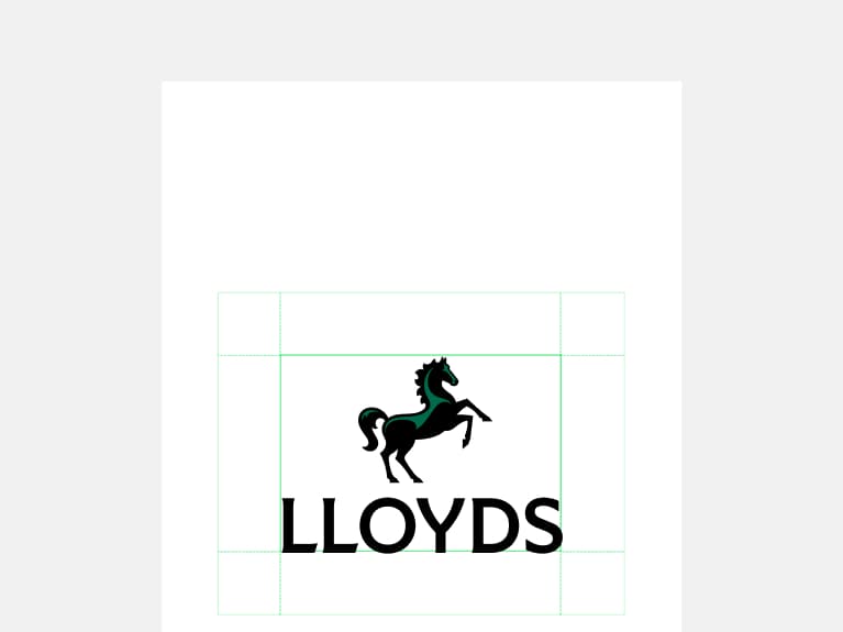
Primary logo
Clear space is defined by 0.5 the height of Cancara.
Secondary logo
Clear space is defined by 1x the height of the logotype.
Cancara symbol
Clear space is defined by 1/6 the height of Cancara. Circular media is defined by the inner square.
Responsive logo use
Our logos react to the formats where they’re used. Wherever possible we use our primary logo. Always take into consideration minimum sizes and legibility when defining the logo break points.
The principles defined here also apply to Lloyds Bank.
01
Regular spacing
Our primary logo is used as a priority wherever space allows it.
02
Narrow spacing
Our secondary logo is used when our primary logo doesn’t fit.
03
Small spacing
Our Cancara symbol used within a Lloyds-owned context (e.g. our app, on our social page).
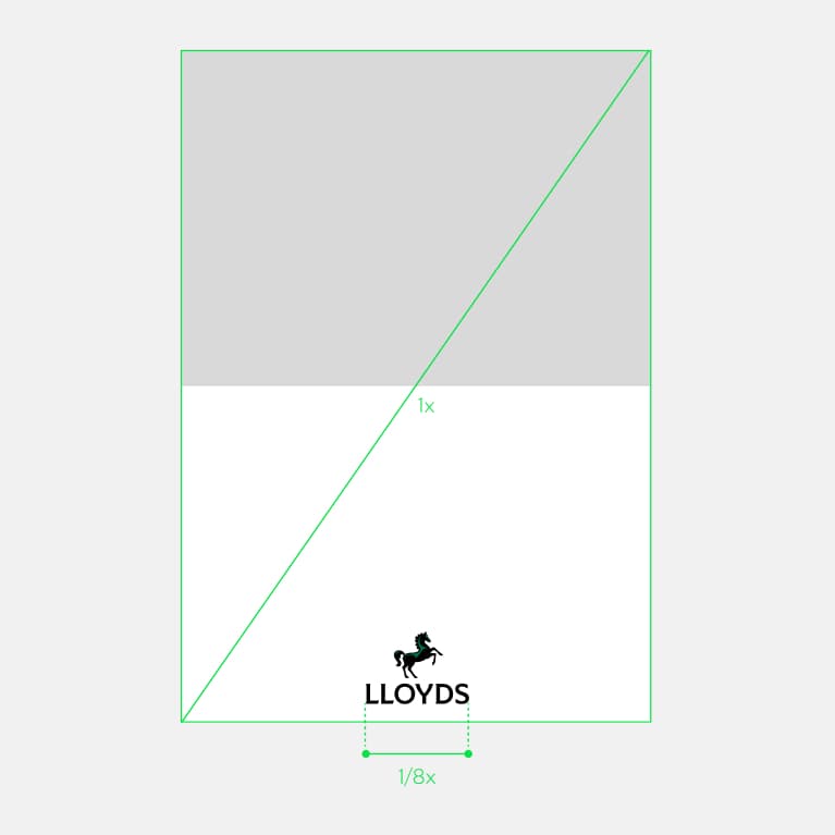
Primary logo in layouts
We use our primary logo wherever possible to make the link back to our brand clear in comms. We always give
it space across our layouts so it stands out and is easily recognisable.
The principles defined here also apply to Lloyds Bank.
Primary logo positive
Used whenever possible.
Primary logo reversed
Used to ensure legibility.
Used confidently
Width of logo is 1/8 the diagonal length.
Primary logo small use
Used when our logo needs to appear at small sizes.
Secondary logo in layouts
To avoid reducing the size of our primary logo in narrow and more restricted spaces, we use our secondary logo. The principles defined here also apply to Lloyds Bank.
Used pragmatically
Width of logo is 1/5 the diagonal length.
Secondary logo positive
Used to ensure legibility.
Secondary logo in a restrictive space
Secondary logo in digital
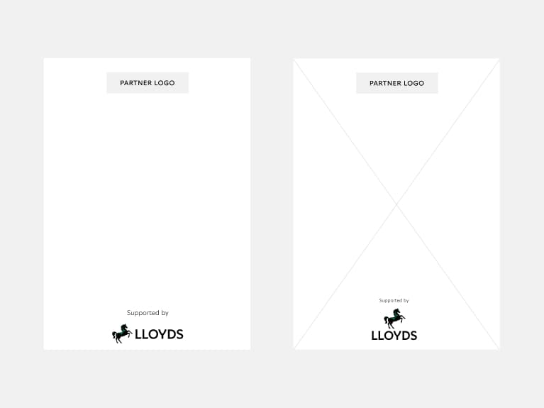
Logo sign-off
We’re proud of our partnerships and third-party associations, so it’s important to have the right level
of protection and guidance in place. The use of a logo sign-off ensures we have a consistent brand presence. Using a descriptor helps us clarify the nature of the relationship.
The principles defined here also apply to Lloyds Bank.
Placement and hierarchy
Where the third party is the lead brand, it’s important for consumers and clients to understand what our relationship is. Careful placement of our logo and the use of a descriptor help to achieve this.
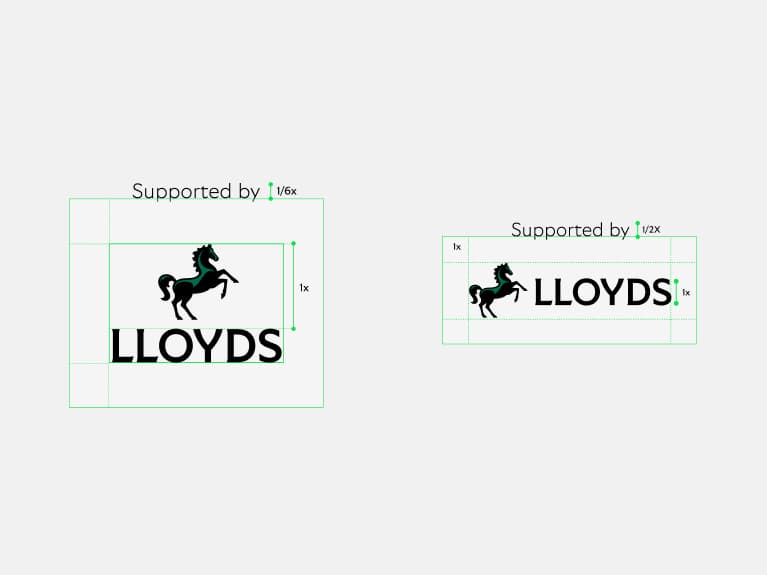
Creating a logo sign-off
The descriptor should sit above the clear space zone of the logo and should follow the size guidance.
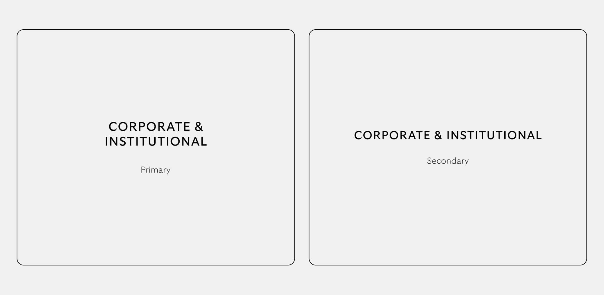
Audience signposts
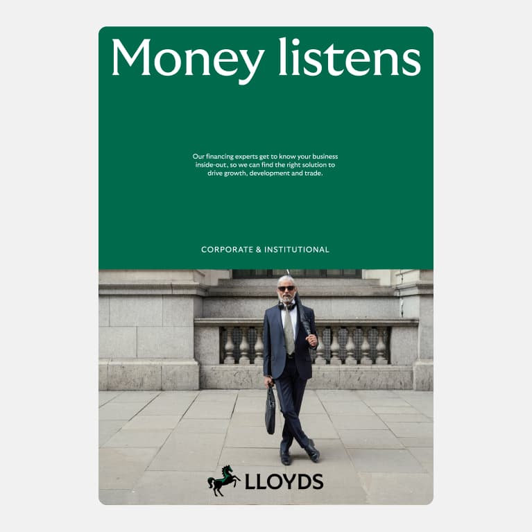
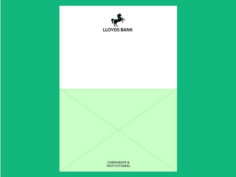
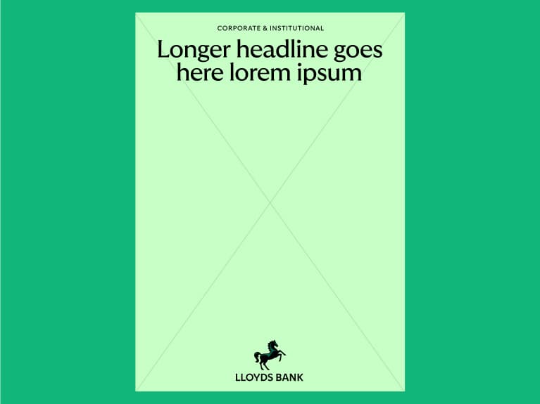
We have audience signposts for Business & Commercial, Corporate & Institutional and Private Banking. International and International Private Banking are part of the ring-fenced bank and require a signpost too. This follows our brand architecture. No new audience signposts or lockups should be created.
Placement
Our signposts should be anchored to the top, middle or bottom. They shouldn’t be locked up to the logo and should be clear and legible.
Usage
Pre-made artwork should be used. We should use stacked primary where possible and secondary where space is needed.
Logo in use
The principles defined here also apply in Lloyds Bank.
What not to do
Our logo is our most distinctive asset so we always look to protect its integrity. We should always ensure or logo is clear, proud and recognisable, always using the master assets provided.
The principles defined here also apply to Lloyds Bank.
Don't outline
Don't change the highlight colour
Don't use colours outside of our palette
Don't mix positive and reversed logos
Don't use a gradient
Non ring-fence bank
The following section captures the logo assets and signposts we use for our non ring-fence bank. All content shown within the previous sections on Cancara, colour accessibility, layouts, etc. also apply here.
Non ring-fence bank overview
We have not created separate brands for our ring-fence and non ring-fence banks.
The legal and business entities that make up our non ring-fenced bank will use the following assets.
For all other aspects of brand application, e.g. colour, choice of type weight, etc. we adopt the approach shown for our Corporate & Institutional audience.
For all other aspects of brand application e.g. colour, type weight etc. we adopt the approach shown for:
- Consumer for Lloyds Bank International
- Corporate & Institutional when communicating to C&I clients.
Our international logo
Please see 'Our name' section where we define how and when you use 'Lloyds' and 'Lloyds Bank'.
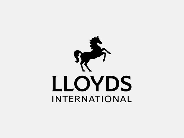
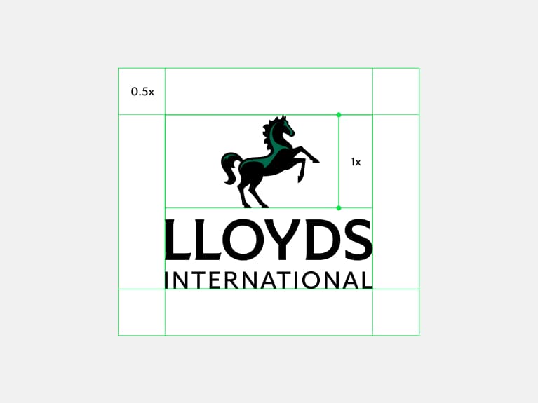
Lloyds International
Primary logo positive
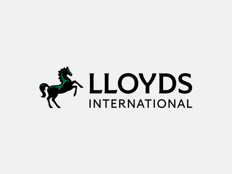
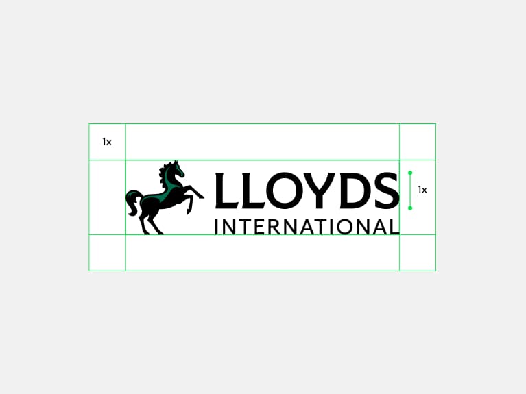
Lloyds International
Secondary logo positive
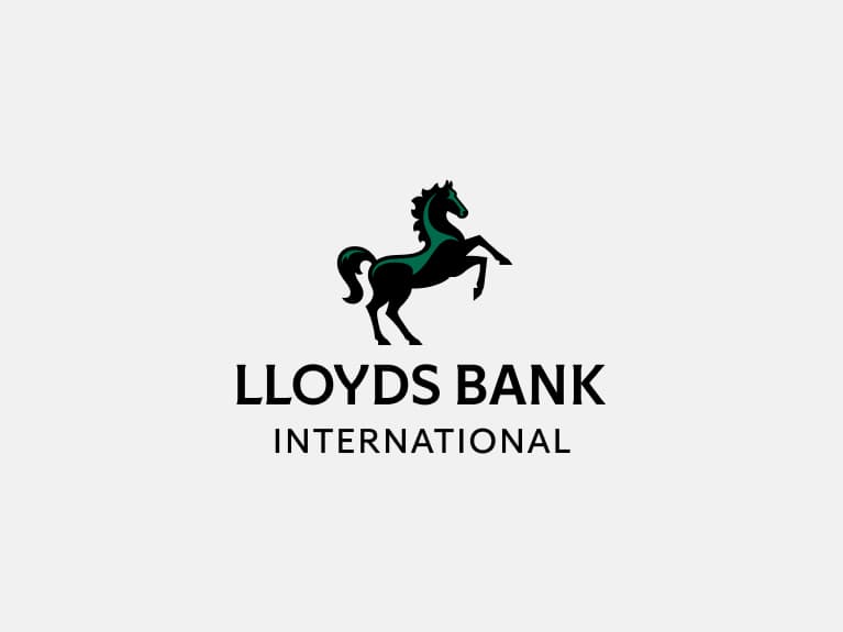
Lloyds Bank International
Primary logo positive
Lloyds Bank International
Secondary logo positive
Our reversed international logo
To ensure our brand is always clear and distinctive,
we have a suite of logo assets for different formats.
To keep our brand consistent, we always ensure we
use pre-created logo assets.
Please see 'Our name' section where we define how
and when you use 'Lloyds' and 'Lloyds Bank'
Logo clear space
To ensure clarity across all touchpoints, our logo needs clear space to stand out. We have defined parameters to make sure our logo is always clear and iconic.
The principles defined here also apply to Lloyds Bank.
Primary logo
Clear space is defined by 0.5 the height of Cancara.
Secondary logo
Clear space is defined by 1x the height of the logotype.
Lloyds Living
Our role is to provide high-quality and sustainable
rental homes and affordable ownership options
for people across Britain.
We have a distinct suite of locked-up logos for
Lloyds Living. They all follow the same approach
as our masterbrand, but with the addition of
the Living specialism signpost.
Our Lloyds Living logo suite
To ensure our brand is always clear and distinctive,
we have a suite of logo assets for different formats.
To keep our brand consistent, we always ensure we
use pre-created logo assets.
Note, there may be some instances where we use the standalone animating Cancara symbol instead of the full locked-up logo. In these cases, the Living signpost will need to be included separately within the content.
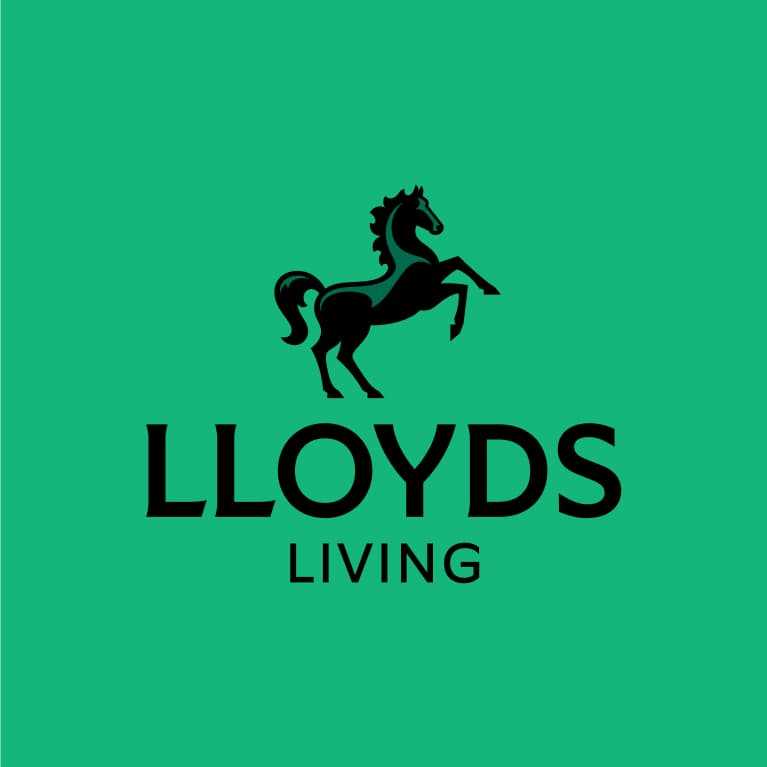
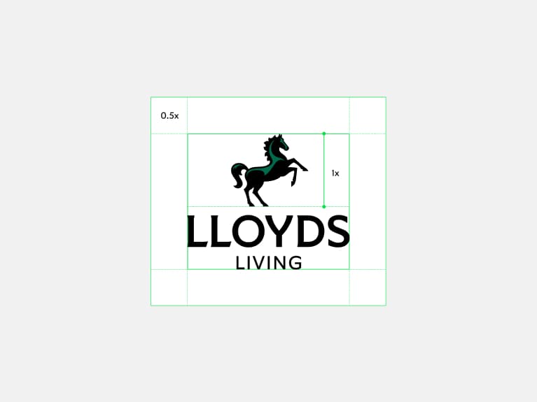
Lloyds Living
Primary logo positive
Lloyds Living
Secondary logo positive
Lloyds Living
Primary logo reversed
Lloyds Living
Secondary logo reversed
Logo clear space
To ensure clarity across all touchpoints, our logo needs clear space to stand out. We have defined parameters to make sure our logo is always clear and iconic.
Primary logo
Clear space is defined by 0.5 the height of Cancara.
Secondary logo
Clear space is defined by 1x the height of the logotype.
Colour
A world of green
We’re a green brand. And we always have been. Our colour inspires trust in our customers and excitement in our future.
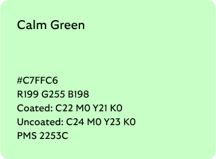
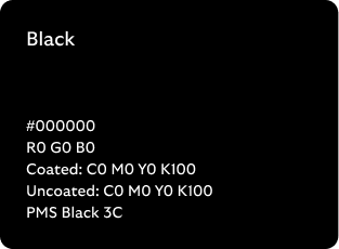
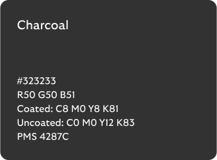
Core palette
We lead with green and have a spectrum of greens at the heart of our palette. This creates tonal variation throughout our brand.
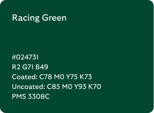
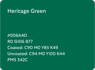
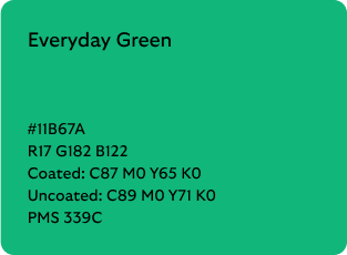
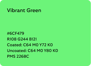

*Only select palette usage. See core palette use for more details.
Our modernised expanded palette allows us to create a wide variety of distinctly Lloyds experiences.
Across the full Lloyds ecosystem, we own a palette of greens - not a single one - allowing us to adapt to our audiences, channels and our content
Some useful questions to bear in mind:
- What is the tone of your content? Is it a moment of celebration where we can dial up the vibrancy or something difficult for the customer where we need to be more sensitive?
- Who are you building for? We can flex colour depending on who we’re speaking to.
- What is the fuller customer journey? You may be creating one piece of a wider journey. Consider how all the parts are going to come together.
- What channel are you creating in? There may be additional considerations on colour choice, such as a dark mode.
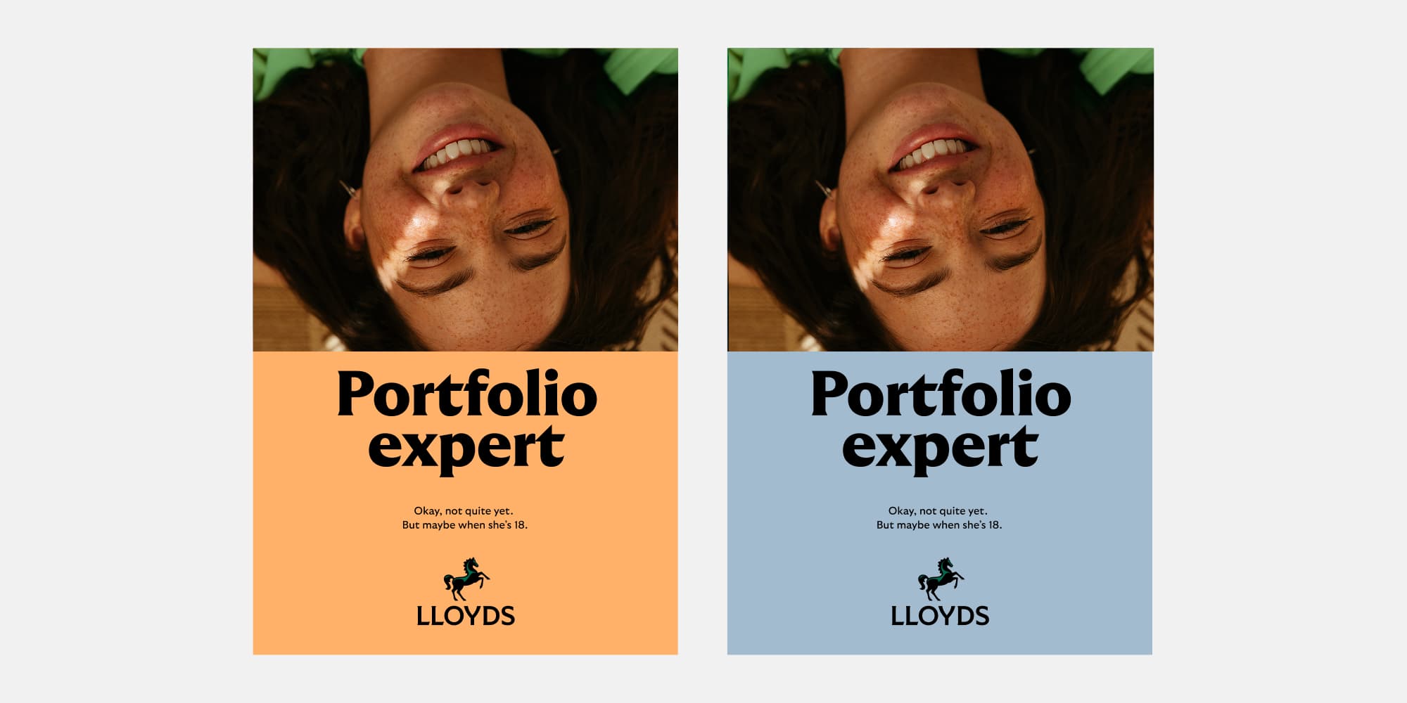
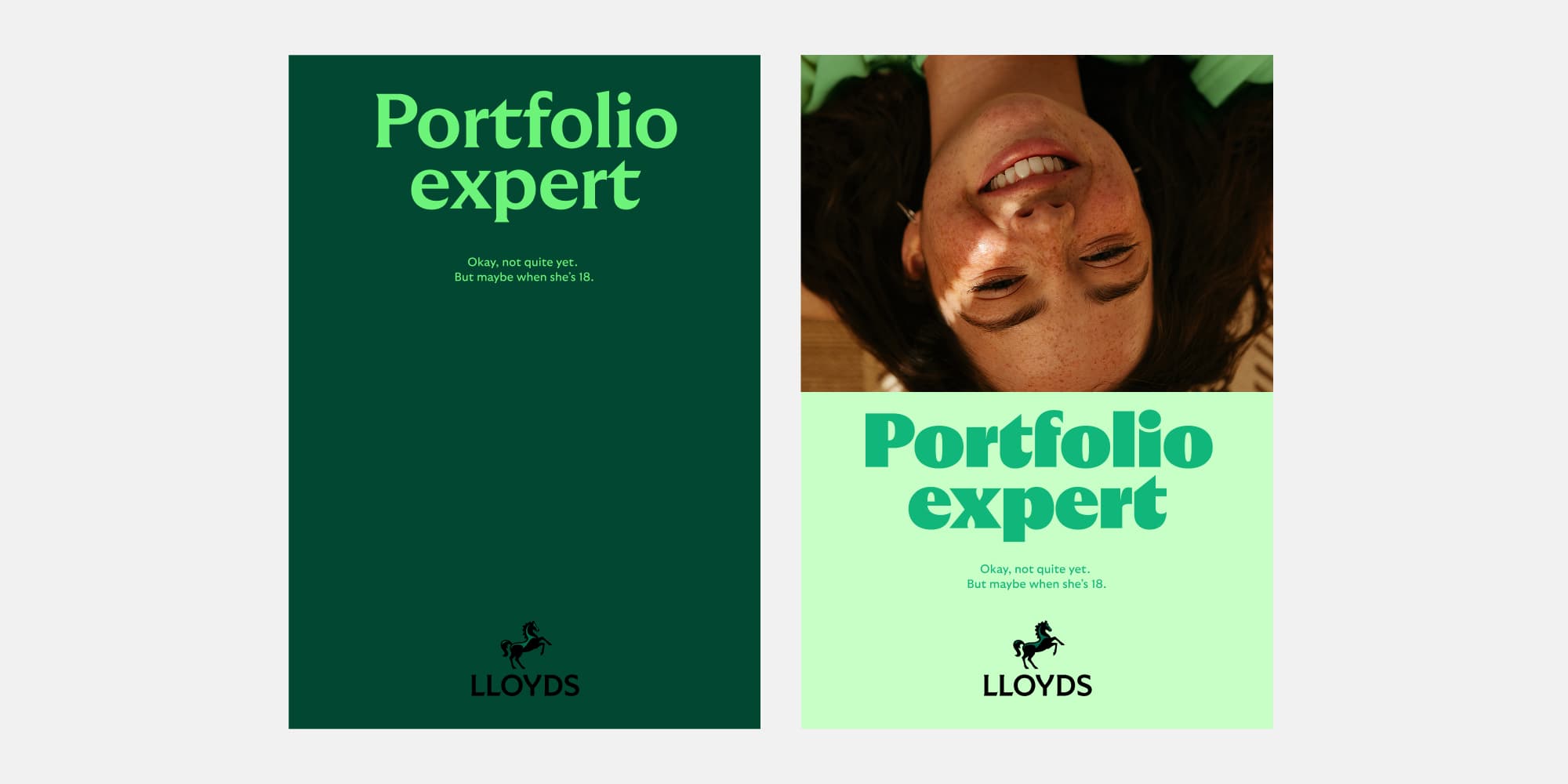
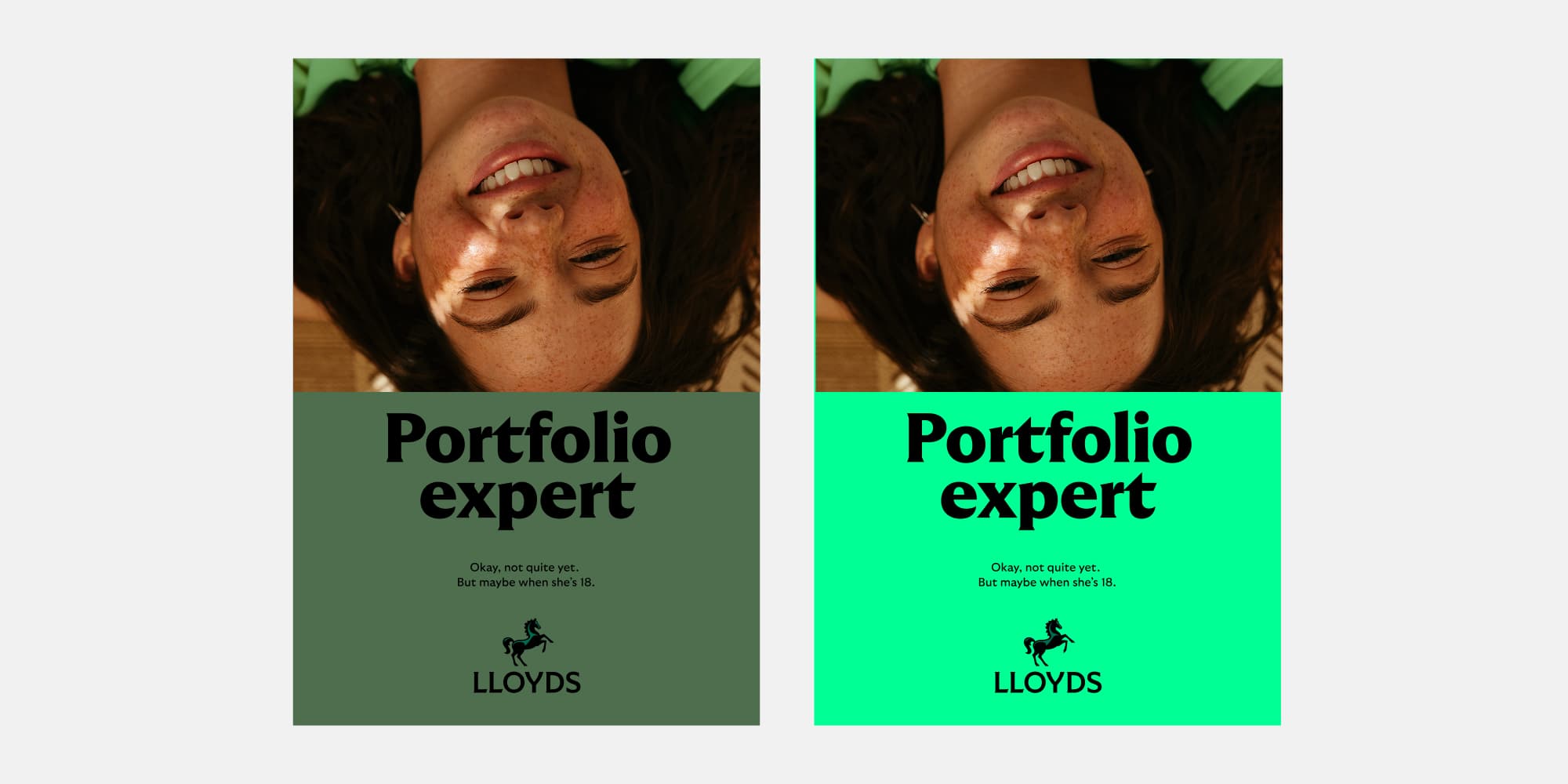
Core palette use
From creating trust to building excitement, our core palette helps us to create different tones. Our range of colours that we use to build Lloyds experiences.
Broad role of green
Always consider the fuller experience you're building to ensure that overall green comes through strongly. For individual touch points we can dial it up or down, but overall the experience should be green.
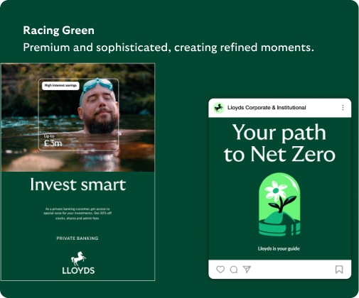
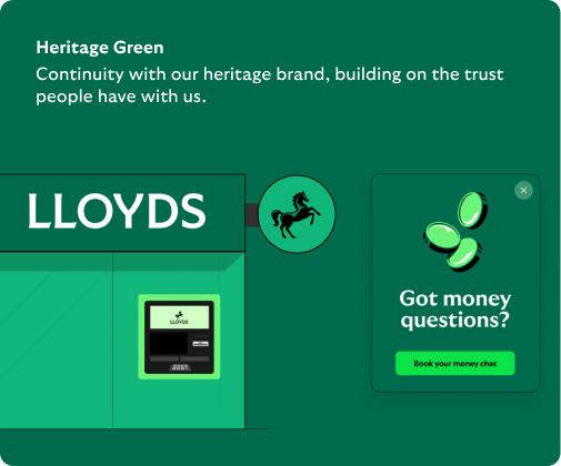
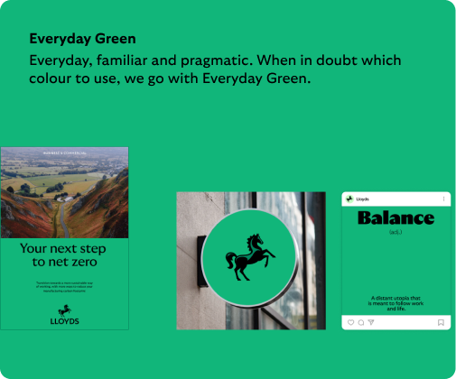
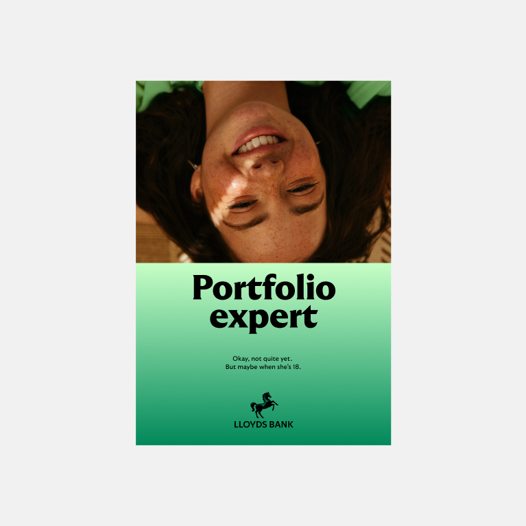
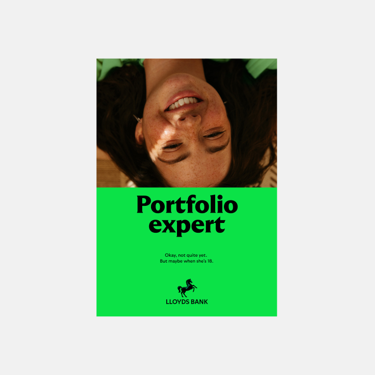
To set the tone
We’re a green brand. We should be bold and confident with it. Using bold green backgrounds in imagery and illustration sets the tone.
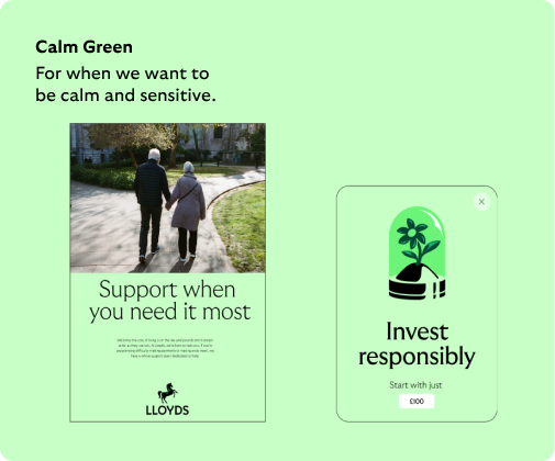
More sensitive
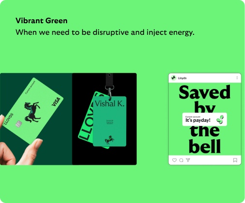
More vibrant and energetic
Print considerations
Due to the limitations of print colour compared with digital colour, there will be nuanced differences in appearance once printed. To ensure we’re being as accurate as possible, use Pantone colours, when possible. If this isn’t possible, ensure you’re using the correct CMYK values.
To set the tone
We’re a green brand. We should be bold and confident with it. Using bold green backgrounds in imagery and illustration sets the tone.
Vibrant Green background
Print example
Everyday Green background
Print example
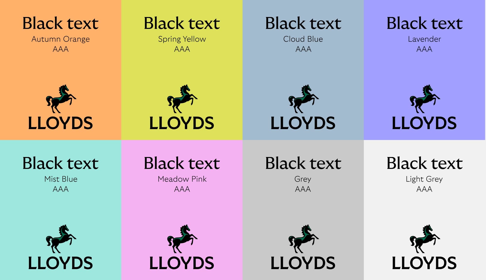
Secondary palette
Our secondary colours are just that, secondary. They support our core colour palette. We use them within illustrations, in data visualisations and for variety within a Lloyds application.
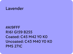
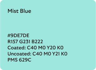
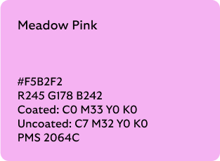
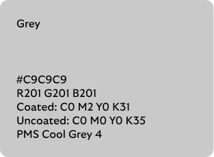
Secondary palette use
Our secondary colours are particularly important within the Lloyds experience. They help us to create distinction, simplify data and reinforce the messages we are trying to communicate. They are used to expand and explain, but are not used to replace our core palette.
Within the Lloyds context
Whilst we always lead with green, we can use our secondary colours deeper within the Lloyds experience, e.g. within our app or a booklet.
Illustration
As backgrounds on spot illustrations to help differentiation.
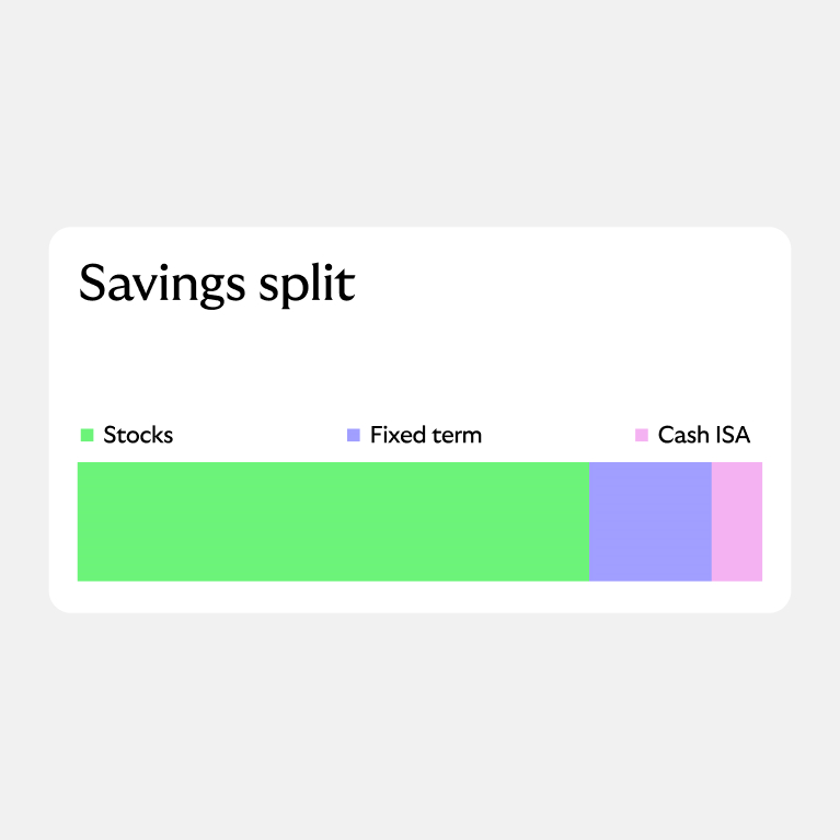
Data visualisation
To ensure we present data in a simple and clear way.
Palette applied
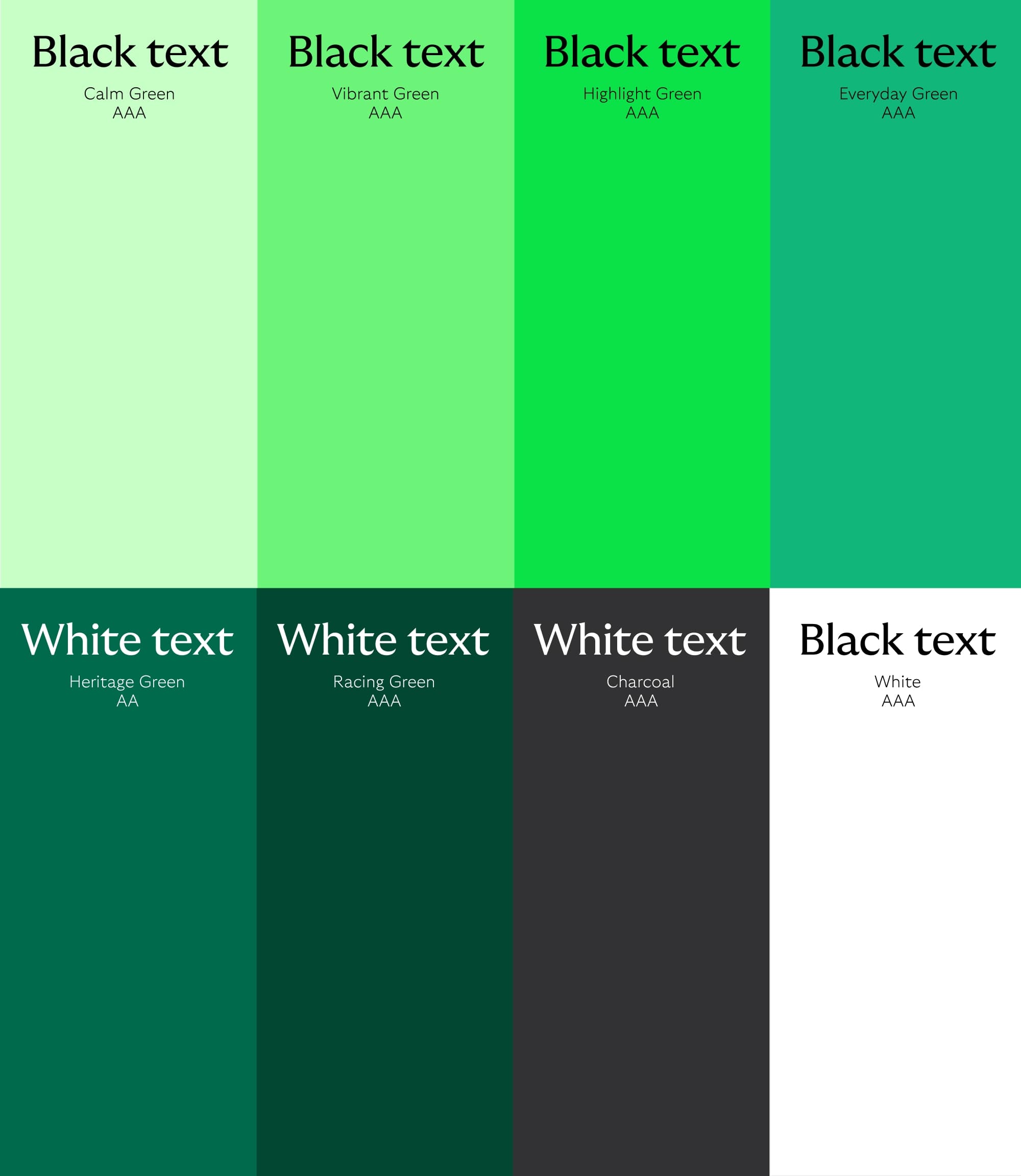
These are the coloured assets we use on our background colours to ensure legibility. Our colours are AA and AAA accessibility when paired with either black or white type.
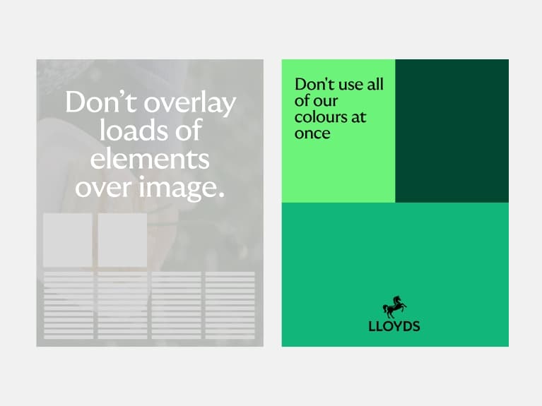
What not to do
Colour is one of our most distinctive assets. To ensure we’re building recognition, we always make sure we’re a green brand, first and foremost.
Don't use gradients
Our colour should always be flat, never gradients.
Don't use Highlight Green as a background
Highlight Green should only be used for CTAs, Cancara highlight and in illustration.
Don't let secondaries dominate
Secondary colour should never dominate, always a supporting colour to our primary palette.
Don't use green type
Type should only appear in black or white when on green backgrounds.
Don't create new greens
Stick to our clearly defined palette.
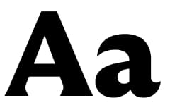
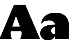
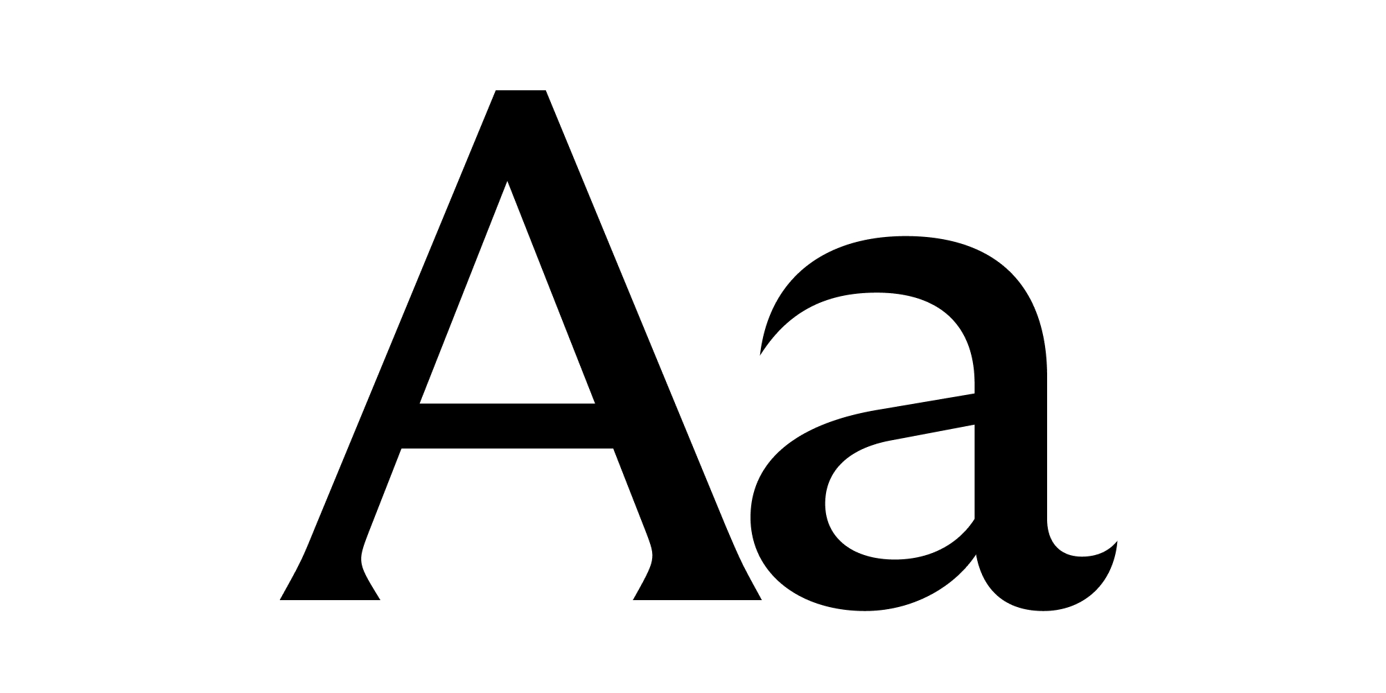
Typography
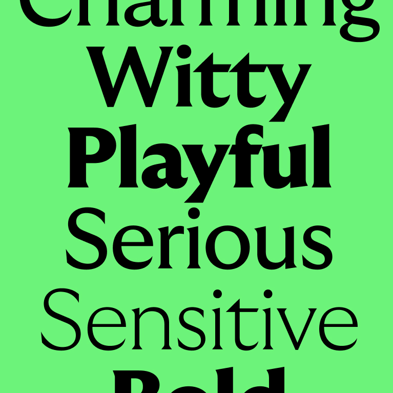
We love our new typeface.
Our type is inspired by early 20th century British typefaces but rendered in a modern, dynamic way. It’s got personality and charm. It’s also pretty dynamic, adapting to different situations.
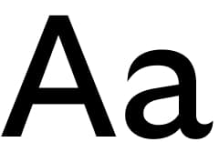
Headline font
We use this for our headlines to strike a harmonious balance between style and utility.
Headline styles
How we use type can help us set the right tone. So, we have a range of headline weights, to help us create tonal variation. Check out our brand flex section to see how we can use different weights across our communications.
Thin
Sensitive
Bold
Everyday
Black
Confident
Ultra
Energic
Headline styling
Clarity is key when it comes to how we set our type. To make sure it is always looking consistent, we always stick to a few ground rules.
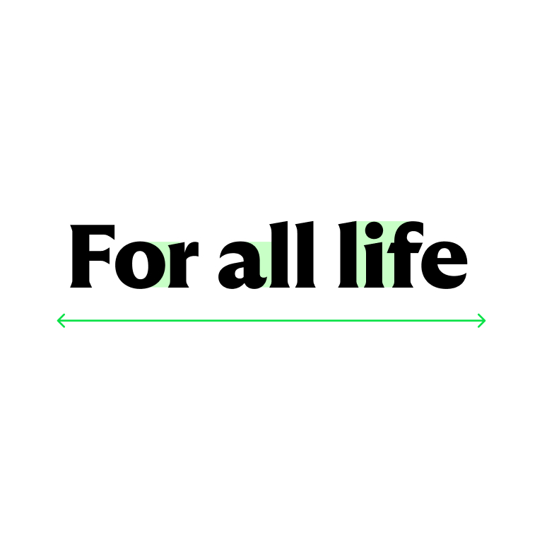
Leading (line height)
We stick to 100% whenever possible. If the gap feels too large, you may want to reduce it to 90% but make sure no ascenders (e.g. I's) meet any descenders (e.g. g's).
Leading is the line height and should be set to the same size as the pixel or point size of the type.
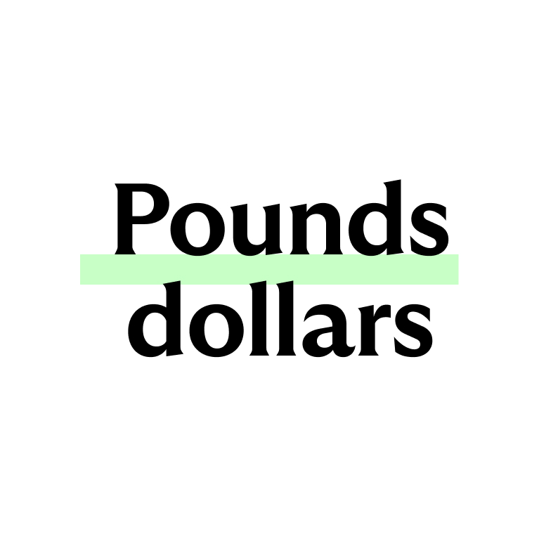
Tracking* and kerning
We keep to -20 or -2% (depending on the software) as our base tracking. Take special care to kern areas that feel too tight or loose.
*Tracking is the space between the letters.

Punctuation
We don’t use full stops in headlines. (The exception is if a full stop is needed to break up two sentences in a headline). All other punctuation should be correctly used. For example, full stops should be used in supporting copy.
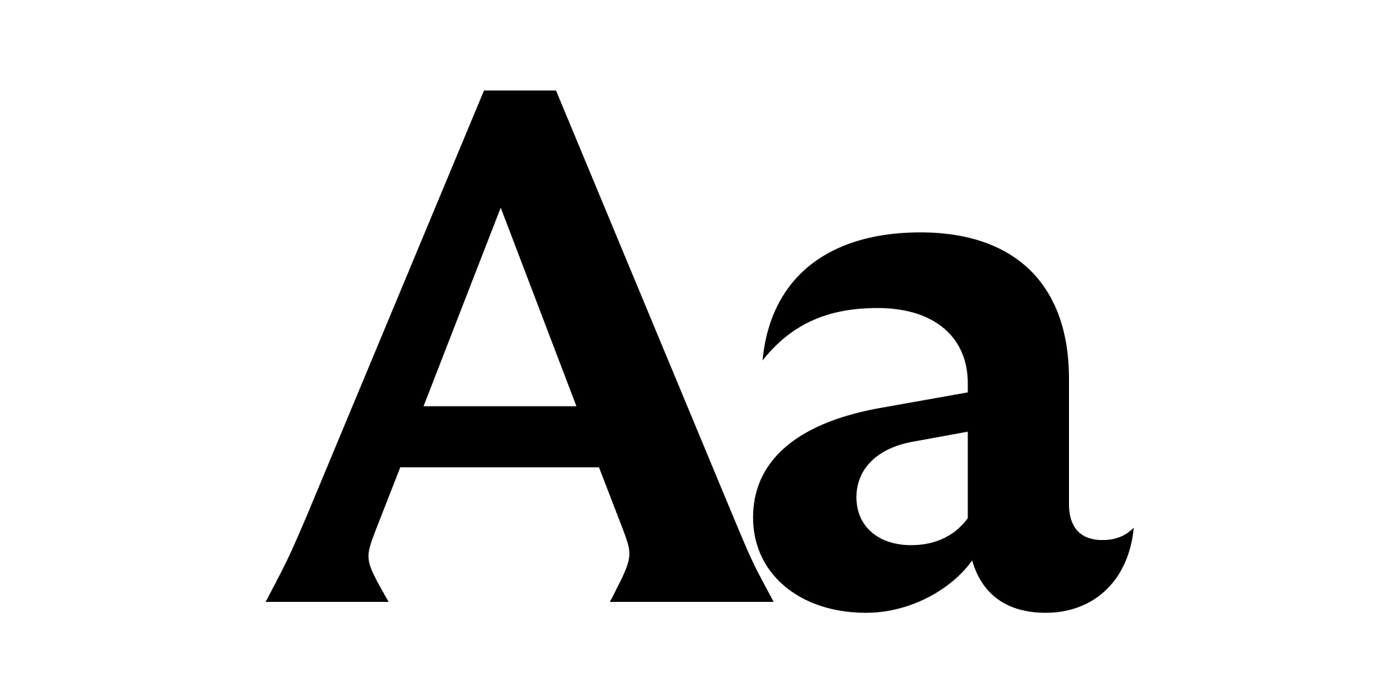
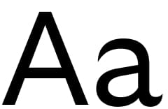
Body copy font
‘GT Ultra Standard’ is our body copy font. We use it to make reading
long form content a breeze.
The technical term for the font
is a ‘sans serif’. Which is great for print and digital. Pretty nice, hey.
Body copy
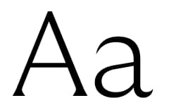
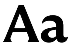
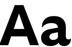
When it comes to our body copy, Regular is our go-to font weight. We also have a range of variations to help us create emphasis where we need and always ensure we have a clear hierachy.
Light
Regular
This is our main body copy
Bold
Body copy styles
We have a range of body copy styles to ensure clear hierarchy. For our body copy we always use a larger leading to ensure accessibility.
Sub headers
- Sub header Body Bold
- Sub header Body Light/Regular
Leading and tracking
- Leading = 120% of point size
- Tracking = 0% or 0 (depending on software)
Tags
- With icon
- Without icon
Call to action
Body bold
Highlight green button
(use white button on vibrant backgrounds).
Type hierarchy
When it comes to how we set our type, it’s all about ensuring maximum clarity. Use size and weight variations to ensure readability. Specific sizing will depend on the specific format, but indicative guidance is provided below.
- Heading
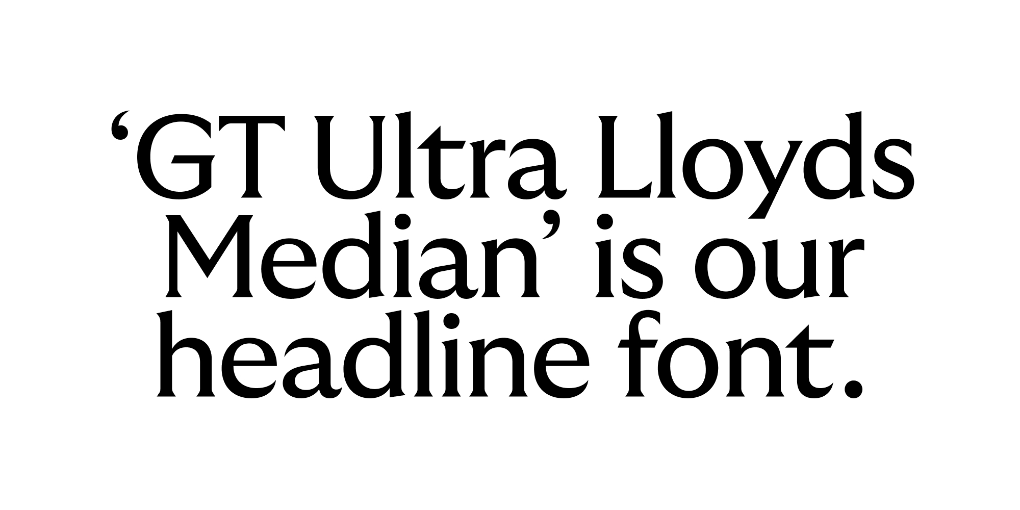
GT Ultra Median Lloyds Headline
Range of weights available
Used to deliver impact messaging as the first thing a reader sees - Subheading
GT Ultra Median Lloyds Headline
Bold
Used to add a second layer of context and guide the reader - Body title
GT Ultra Lloyds Body
Bold
Signal a section within the body copy - Body
GT Ultra Lloyds Body
Light/Regular
Legible at small sizes and long form text - Caption
GT Ultra Lloyds Body
Light/Regular
Smaller then body copy, adding tertiary information
Type relationships
Below are examples of size relationships between headline and body copy. We always ensure maximum legibility, whilst expressing ourselves confidently with scale.
Size
Headline should command the space and body copy should be between 3-6 times smaller than the headline (depending on the format).
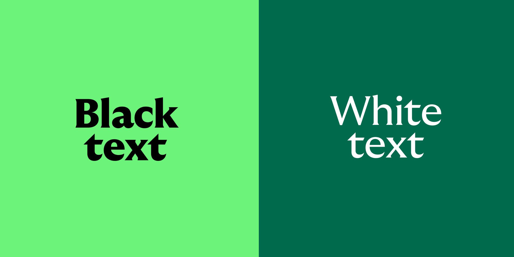
Type colour
We keep things simple and only ever use black and white type. This ensures our communications are clear and accessible. To find out more about accessibility, check out the colour section.
Type alignment
We typically centre-align headlines and subheaders, while left-aligning body text for better readability. Explore our layout section for additional information on how we arrange text.
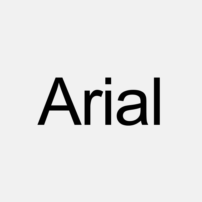
Fallback font
We can use Arial in these circumstances if the licence for Arial is included in the system being used, e.g. Microsoft, Adobe, etc.
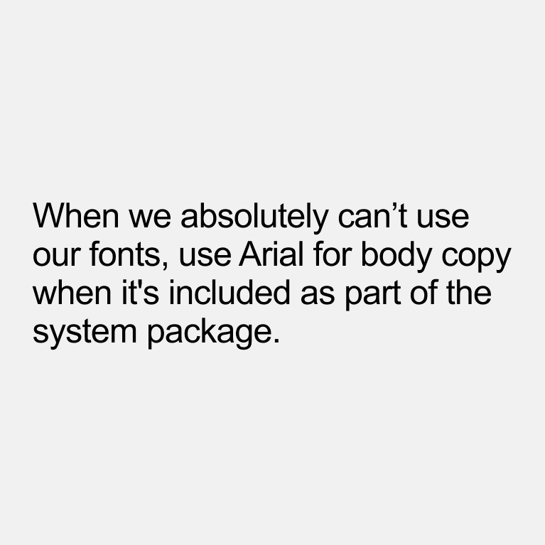
Fallback body copy
Only use for body copy when necessary, for example on some system generated content or a letter sent by email that is not shared as a PDF.
Some handy tips
Type is key to the clarity of our communications. To ensure we maintain brand consistency, we have a few rules we always follow.
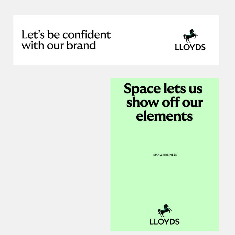
Keep as much space as possible
White space works. It shows off our assets and our beautiful brand.
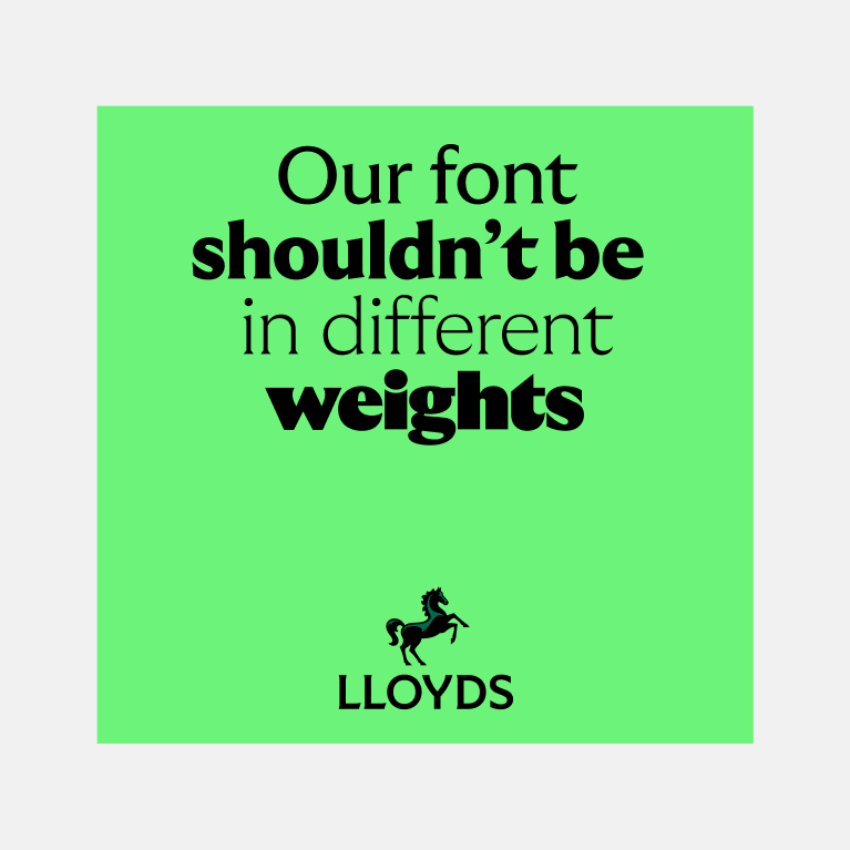
Don't use loads of different weights
Try to keep to one weight for your headlines. In special uses you might use another weight for emphasis on a word but this should be done very sparingly.
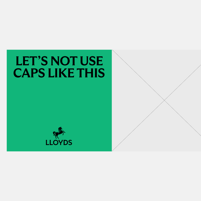
Don't use all caps
We keep our headlines in sentence case.
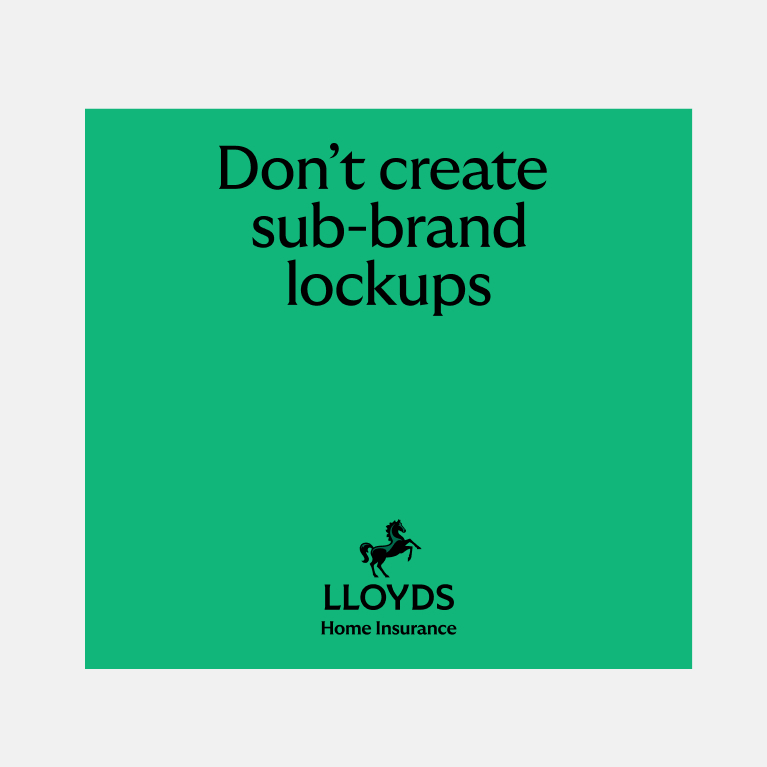
Don't create new lockups
We never lock-up headlines, body copy or specific offers with our logo.
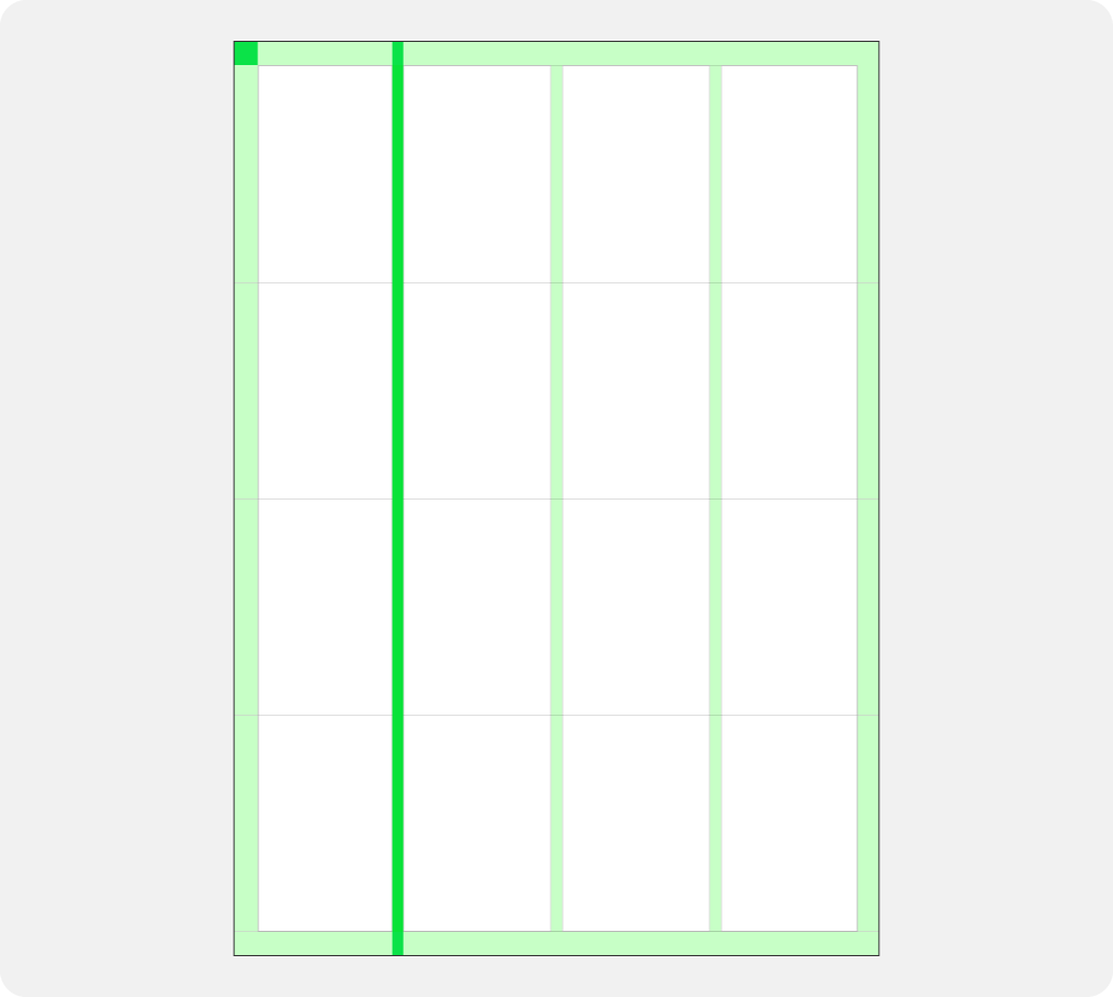
A pragmatic structure
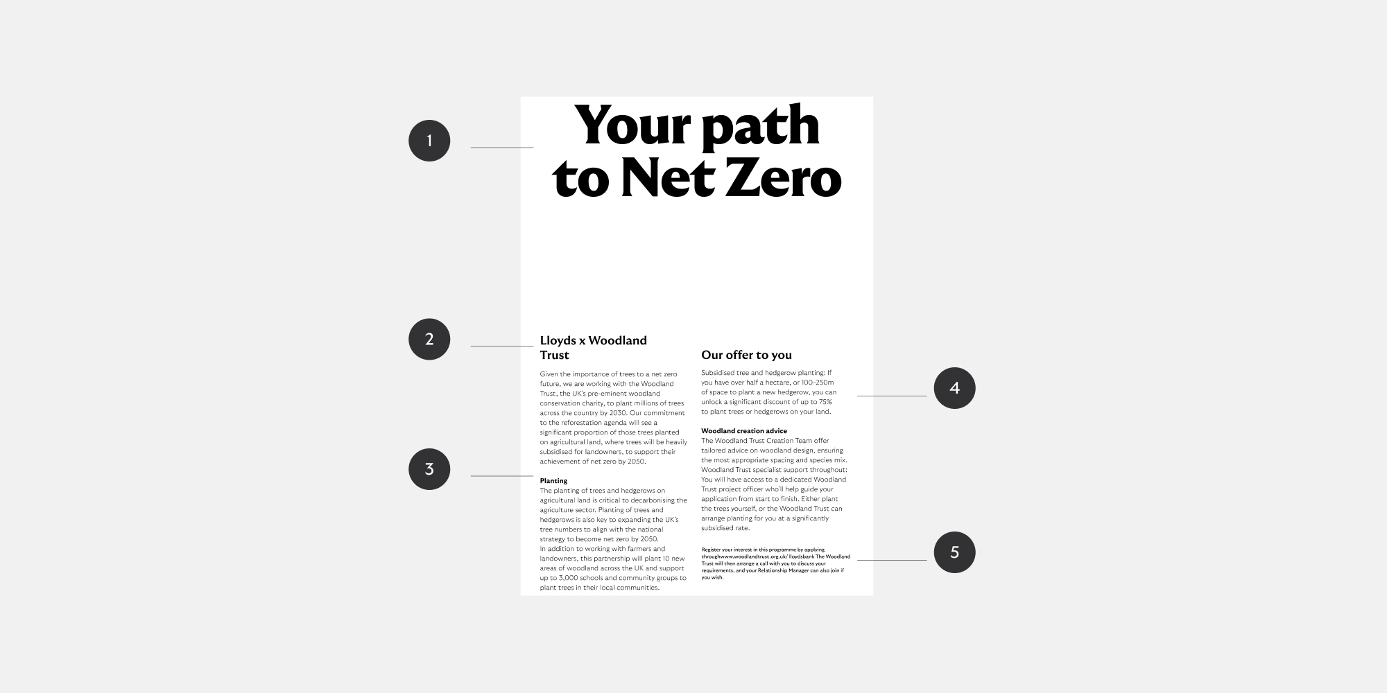
Our layouts bring our design elements together. We’ve built a structure that is pragmatic – adapting to the different situations our brand shows up in.
Equally balanced layouts
We have a variety of layouts that are built from our centre. They compliment the more expressive parts of our brand, and feel balanced yet connected to one another. The layout we use depends on the format and purpose of the communication.
Built around the centre
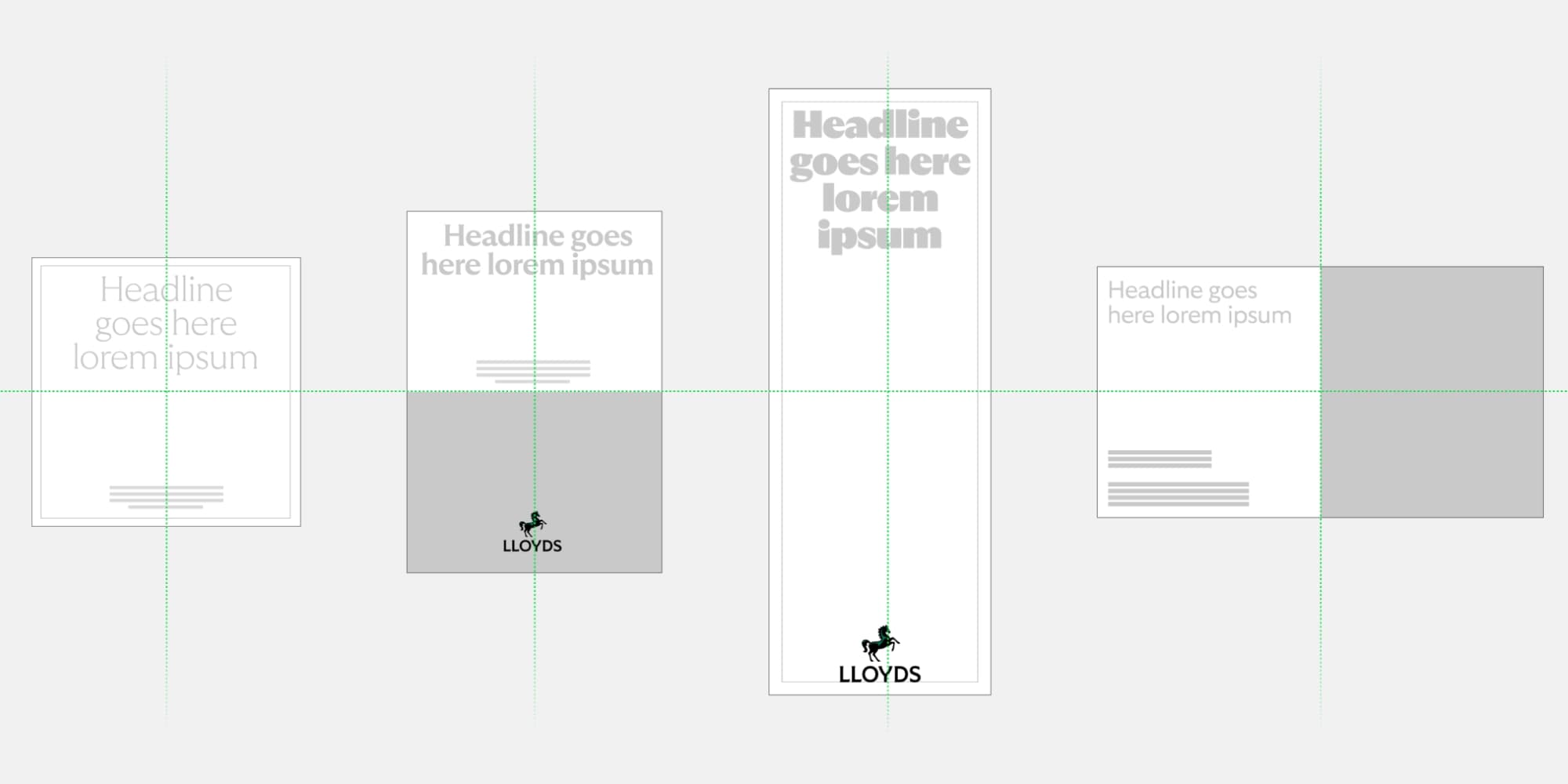
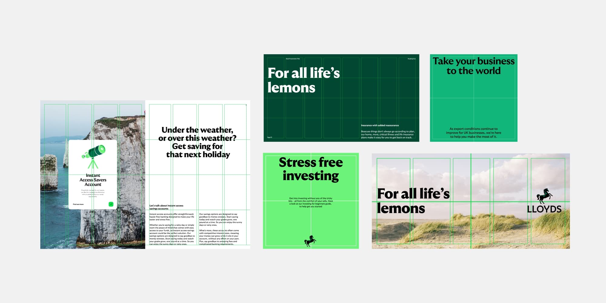
Layout construction
We use space with confidence and always give our content breathing space. The way we build our layouts helps us do just that.
1: Choose your format
Choose a format that is best for your communications.
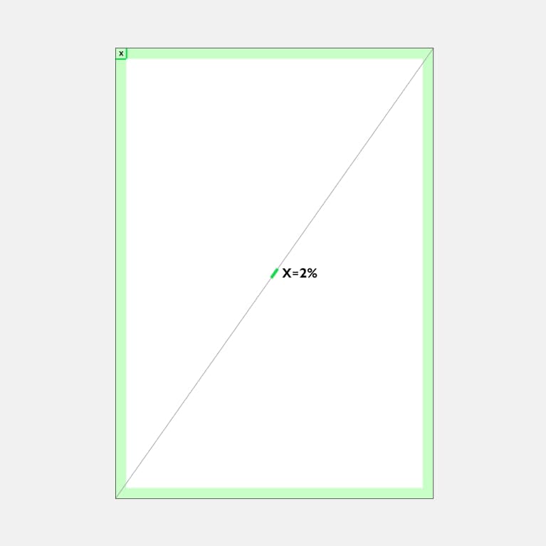
2: Set your Margin
X is 2% of diagonal distance.
Round up number for Px and mm size.
Consider any print restrictions when doing this and alter accordingly.
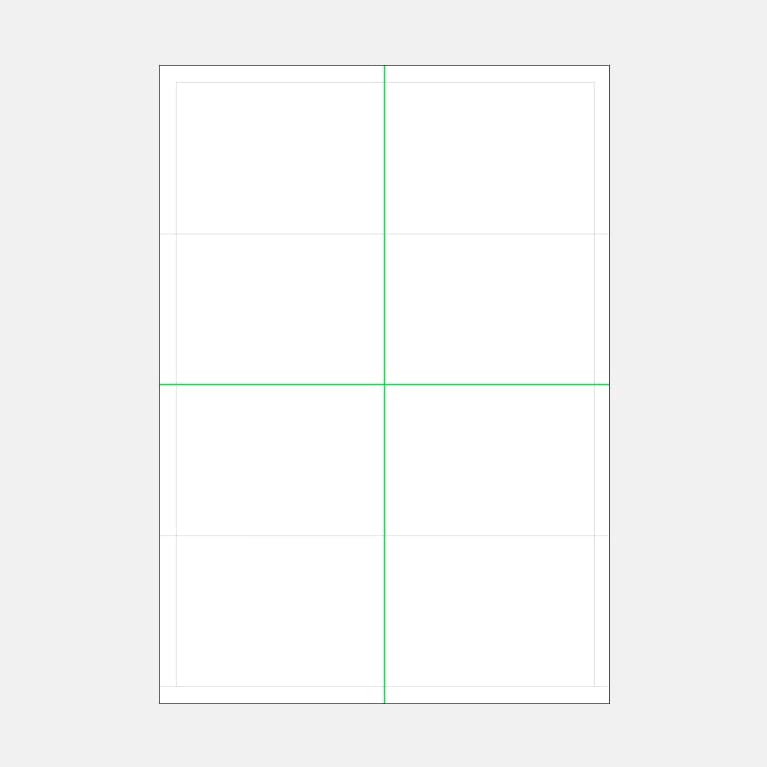
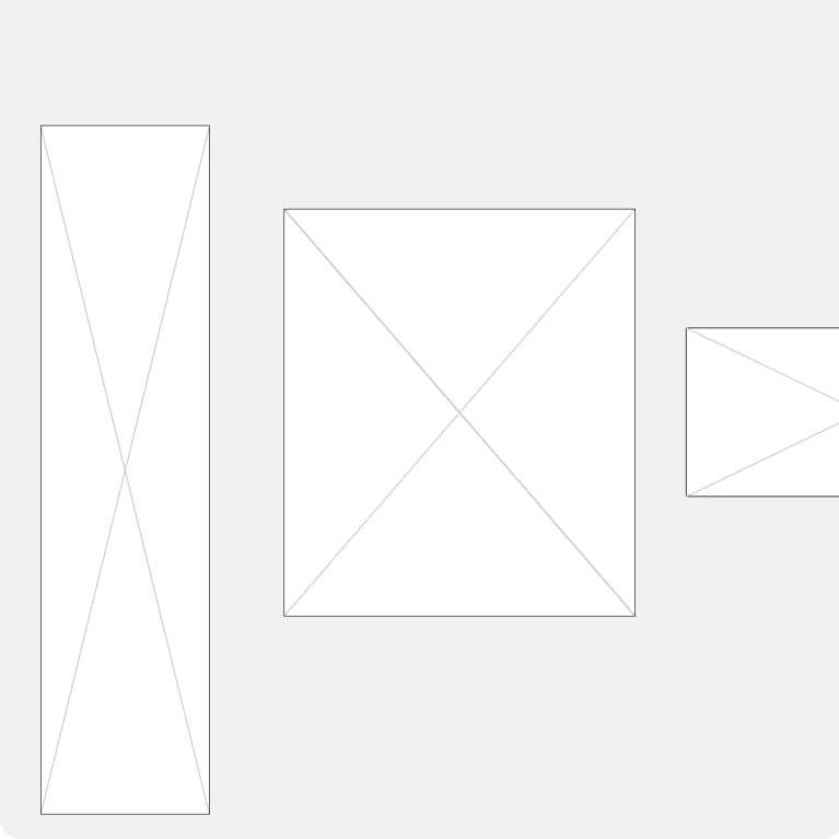
3: Construct a grid
Choose a format that is best for your communications.
4: Gutters
Add more guide lines and, if needed, use gutters.
To work this out use 1/2 of X (margin width) = gutter size.
Composition styles
We have a variety of layouts that are built from our centre. They complement the more expressive parts of our brand, and feel balanced yet connected to one another. The layout we use depends on the format and purpose of the communication.
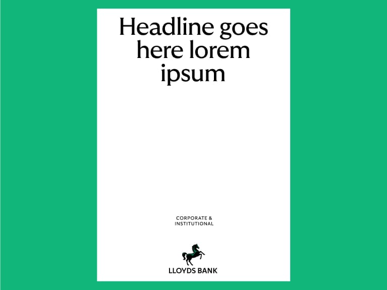
50/50
Split horizontally or vertically, using layout to create two defined areas: one for text and one for image.
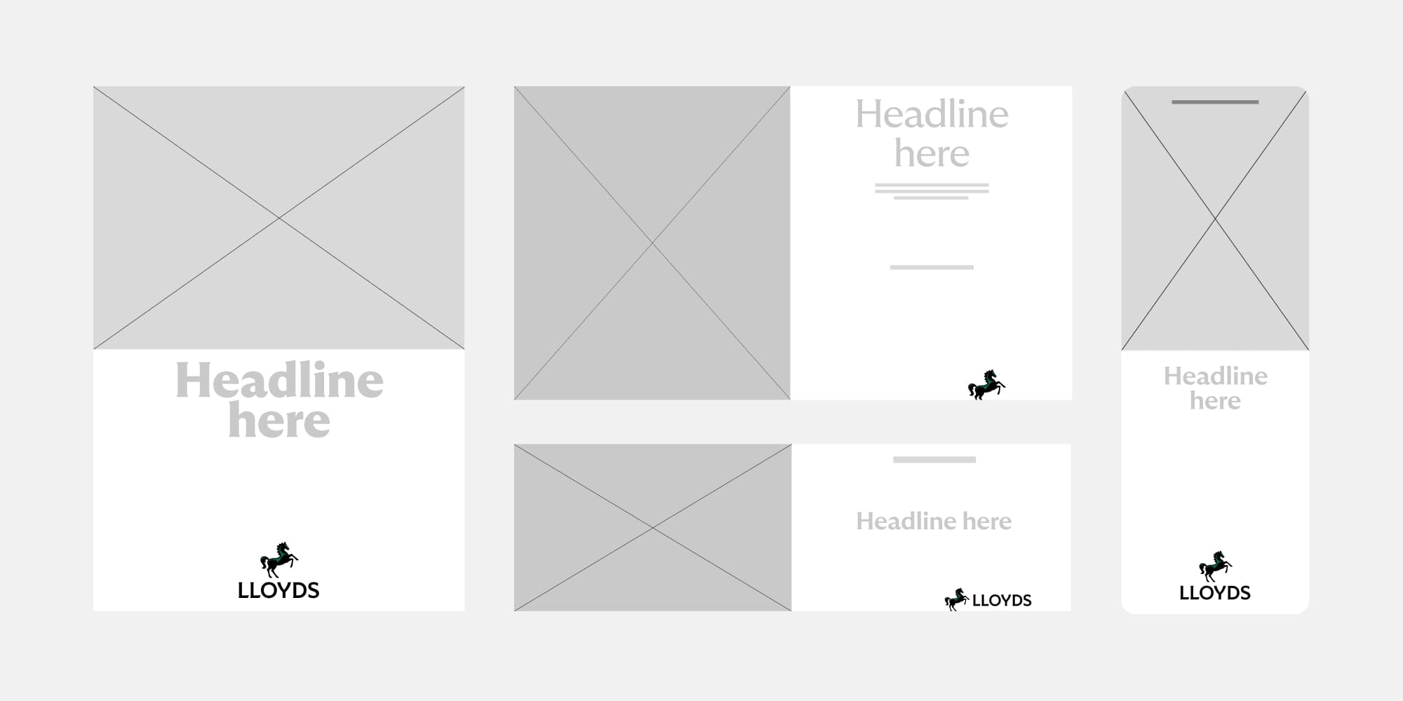
Full bleed
Full bleed fills the layout with colour or image.
When to use them
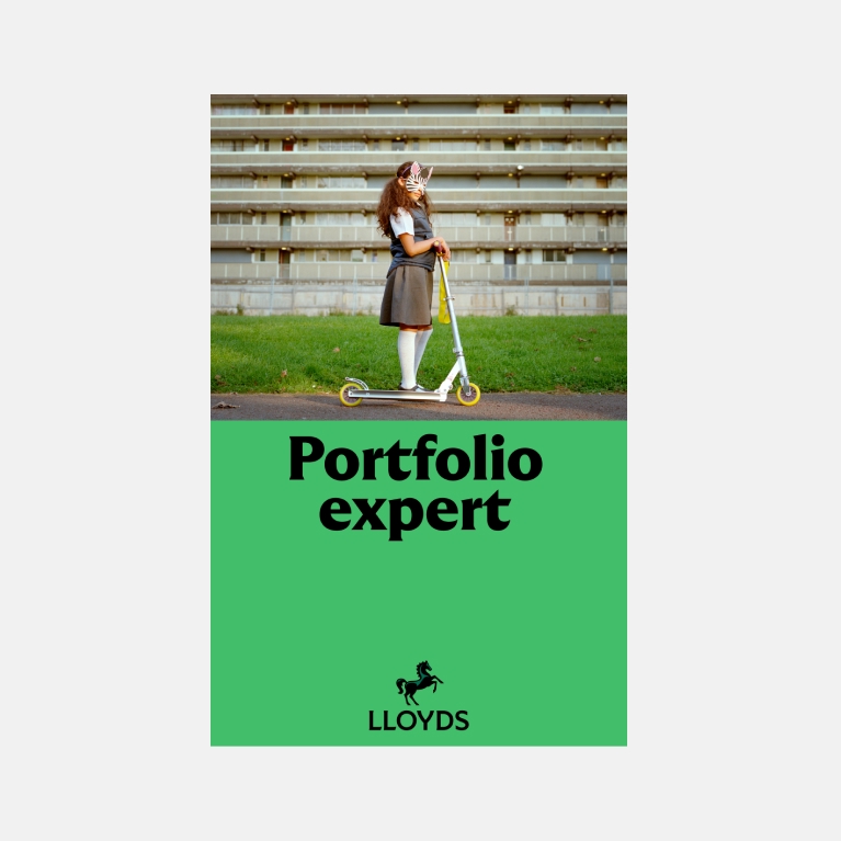
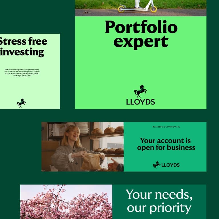
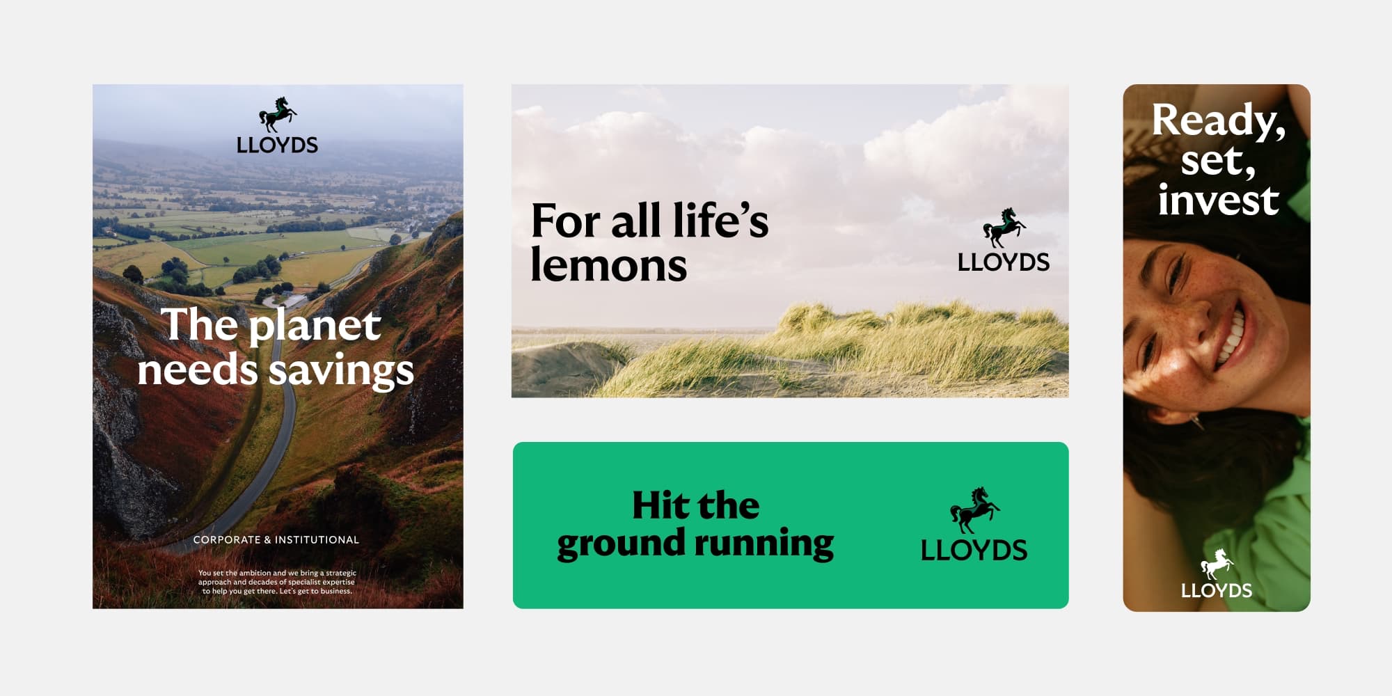
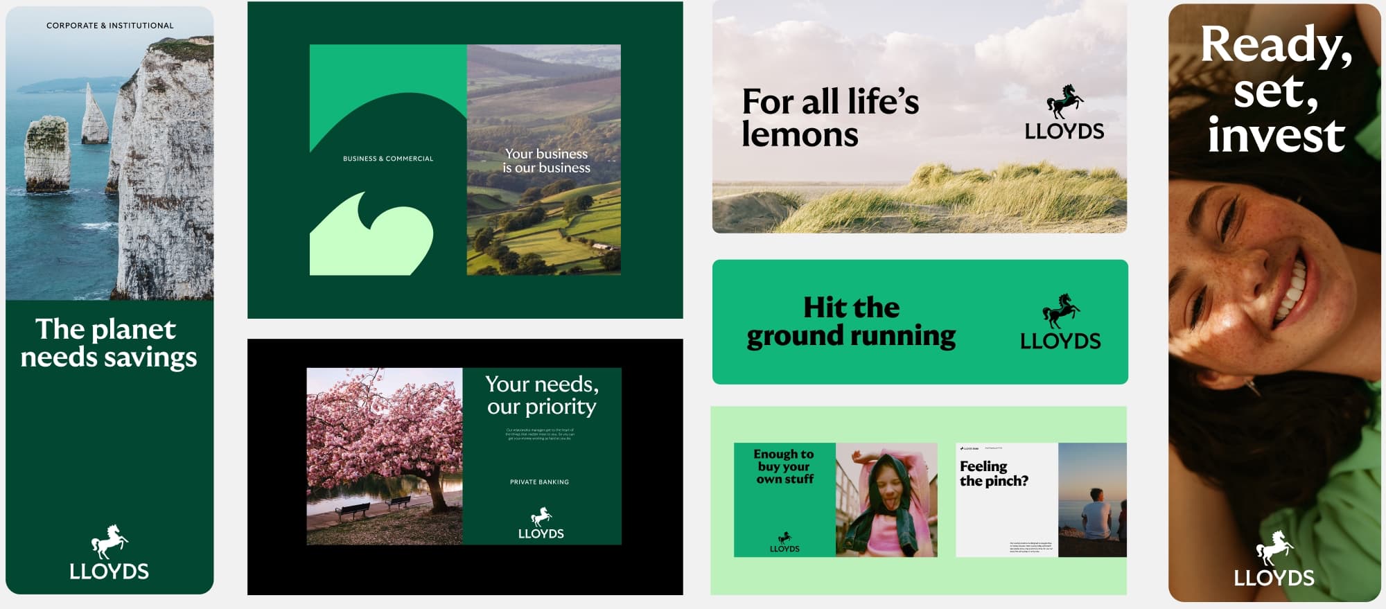
What layout we use depends on the purpose and format of our communication. We use our 50/50 approach to for clarity and structure and full bleed layouts to give our content impact.
50/50
50/50 layouts are used to keep image and text separated for legibility. This is particularly useful if the image is busy or we have a lot of copy. It also allows for our brand colour to show through strongly.
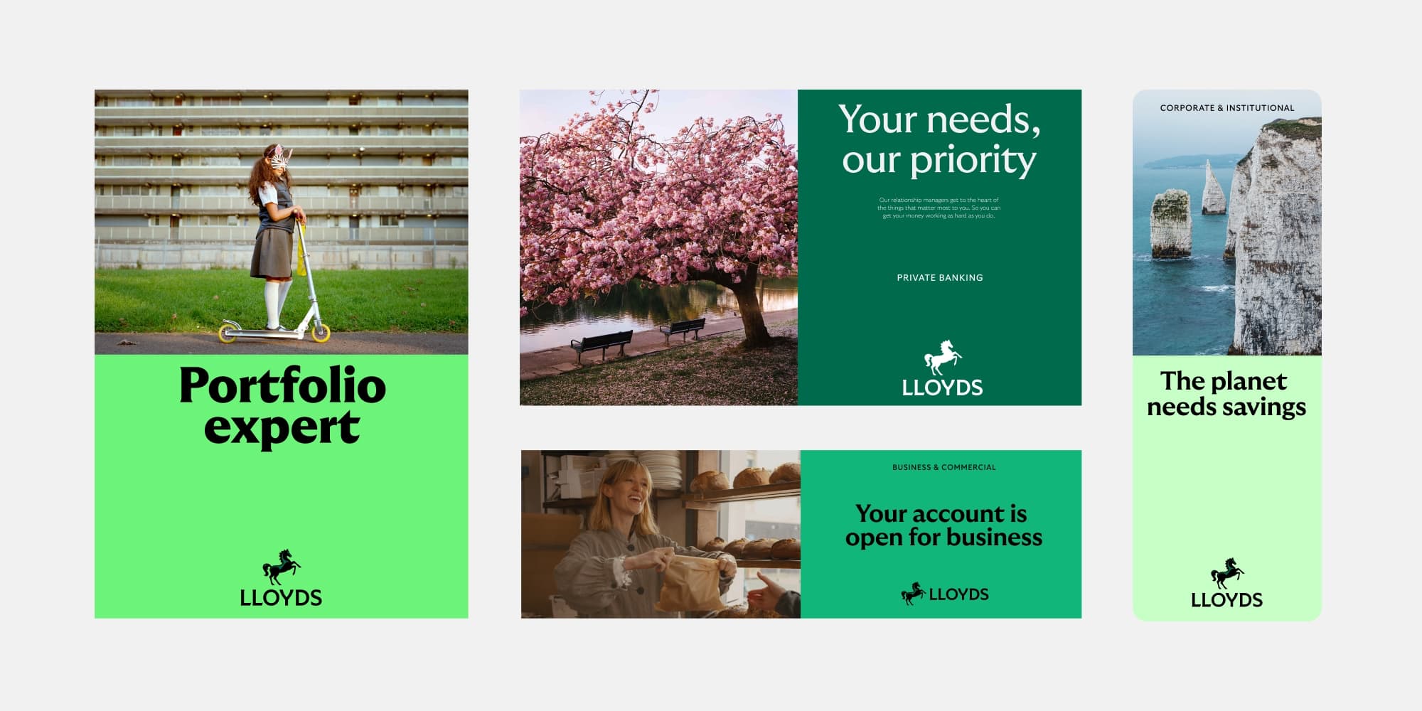
Full bleed
Full bleed is used to create impact with bold brand colour or image. Best suited to uncluttered images or limited copy.
Layout in use
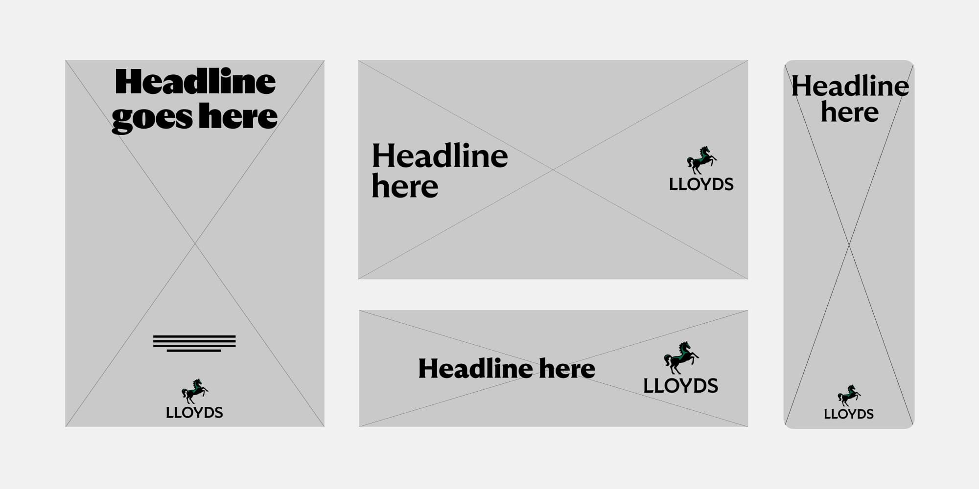
Grids in use
Our grid system feels pragmatic and helps complement our more expressive elements of our brand. It provides structure that ensures our elements are always in balance.
Examples
Using the grid for different applications.
Handy tips
Our layouts give our communications stucture and hierachy. They can also create a sense of pace and rhythm. Here’s a few quick tricks to ensure they’re always working hard for our communications.
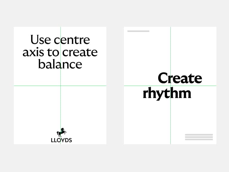
Use the centre axis
Alignment to the grid helps us create harmony and add rhythm to our compositions.
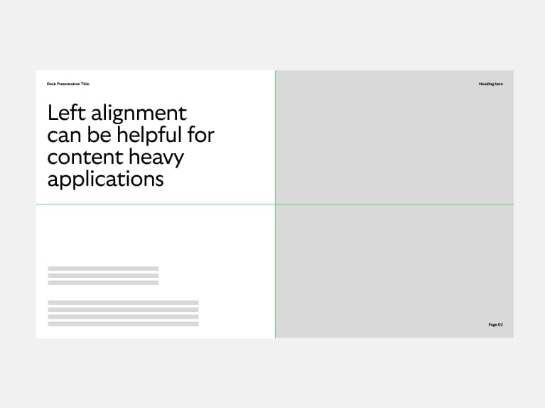
Prioritise accessibility
If compositions are content heavy, opt for the simplest layout to create clear hierachy.
Keep as much space as possible
Clear space works. It shows off our assets and our beautiful brand.
Have fun
Our brand is designed to flex so use it to bring pace and charm to layouts.
What not to do
Layouts can hinder, not help, if used incorrectly. To ensure we’re using them effectively, we have a few rules we always follow.
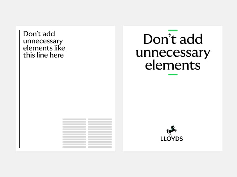
Don't decorate
We don’t need to over embellish with unnecessary elements.
Don't make it overly complex
We don’t need to use all of our brand assets all at once. Keep it simple and impactful.
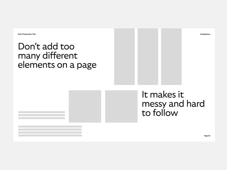
Don't clutter the page
Make sure you give enough space to everything on the page.
Don't forget the content
Keep in mind whether the layout will be seen in or outside a Lloyds environment and alter accordingly.
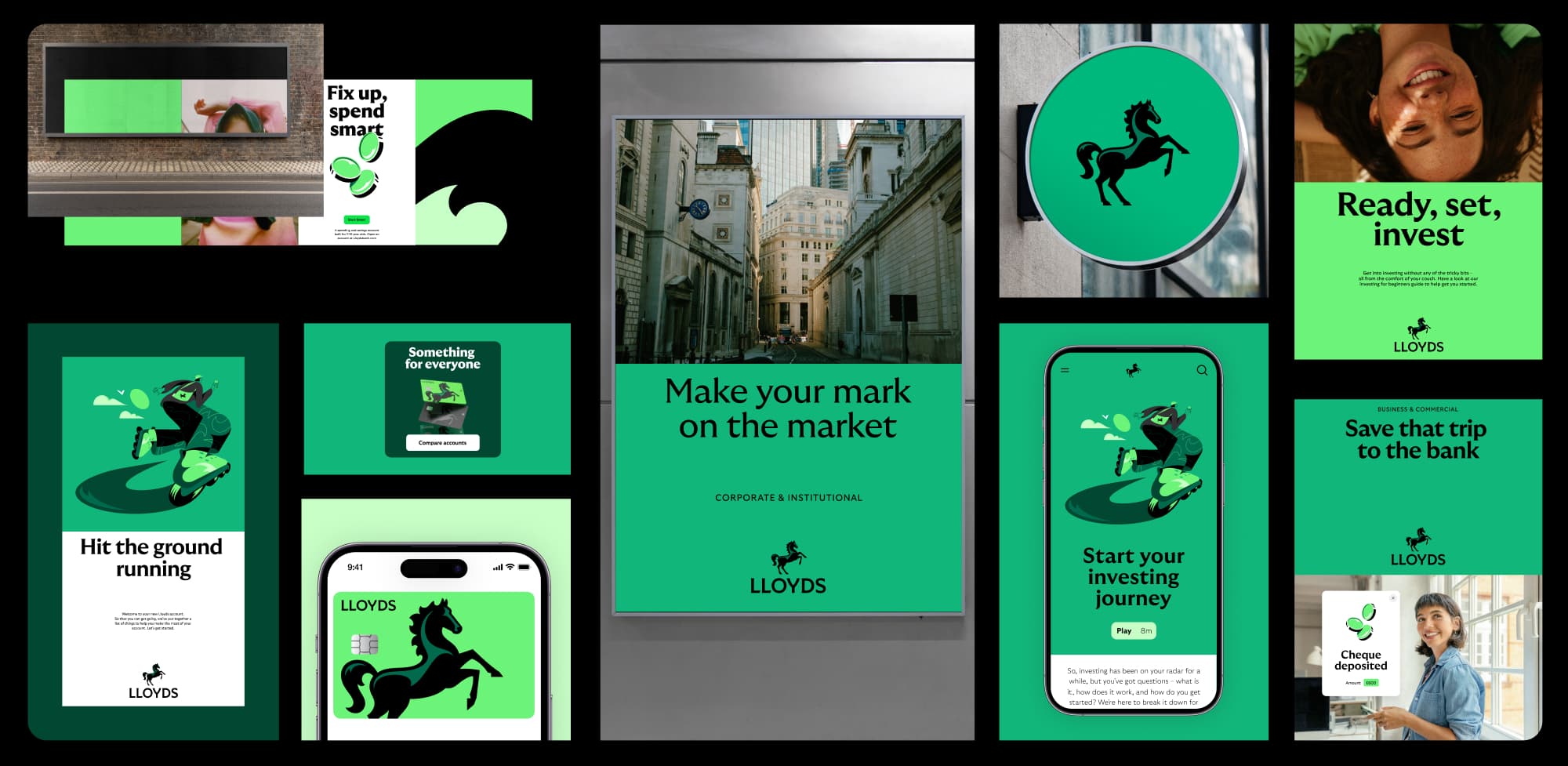
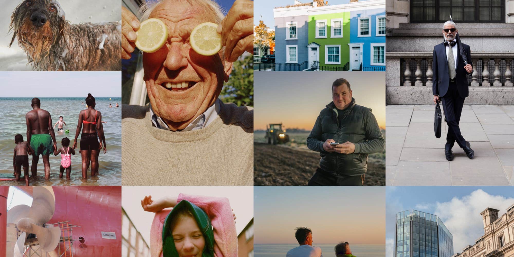
Photography
Celebrating everyday Britain
We've been the bank of Britain for 250 years, so we really get our customers. Our photography celebrates what makes Britain so wonderful. Real people, hard-working businesses and the quintessentially British landscape. But we also operate internationally in Commercial & Institutions. So, when appropriate, our photography celebrates those markets too.

Overview
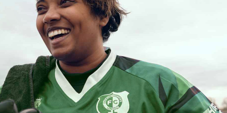
Most of the time, our photography celebrates everyday Britain through incidental and genuine moments from the lives of real people. We show empowered and confident individuals across all our audiences.
Photography principles
Our photography principles are based on our design ethos. We use them as a guide to shooting or selecting photography and help to ensure that all of our imagery feels like it celebrates everyday Britain in a uniquely Lloyds way. All three principles should be present but can dial up and down depending on the context.

Pragmatic
We show life that’s relatable, real and down to earth. And we relate to people where they’re at, no matter what they’re going through.
Optimistic
We look on the bright side, but we're not delusional about hard times. We show a life that's aspirational but not unachievable and so capture moments of beauty in the everyday. Our images colouring should feel warm and rich, without being glossy or saturated.

Charming
We celebrate the uniqueness of ‘Britishness’ and the personality, character and sense of humour that brings with it. We look for the charming moments to celebrate everyday life.
Championing modern Britain
To quote a famous superhero, with great power comes great responsibility. Brands have enormous power to influence and shape culture. So we want to ensure ours are a force for good. For us that means championing the Britain we believe in and want to see: one that’s modern, inclusive and diverse. These principles give us a way to do this.
Portray the person
Defy restrictive stereotypes to present people the way they’d like to be seen.
Think 3D
Consider all the layers of identity of the people you portray.
Authenticity is in the detail
Focus on the nuances for true-to-life representations.
Word association counts
Make sure the language you use alongside an image doesn’t reinforce an unhelpful trope.
Representation matters
Try to represent all ethnicities — particularly underrepresented ones (e.g. Asian or mixed heritage).
Equal prominence
Ethnicity shouldn’t determine social or economic status.
Sensitively challenge bias
We don’t need to pick fights — we simply do and show the progressive world and ideas we believe in.
If in doubt, check
Don’t be afraid to ask an expert — that could be an external cultural advisor or an in-house diversity panel.
Art direction
We want our style to feel in line with our principles and show a real, honest Britain. Here are three things to consider when shooting, selecting or retouching images.
We have real, honest grading
Our imagery should feel real and natural - never too polished or over-produced. We let the colour be desaturated or sing where it naturally would (even with our weather). We don’t unnaturally enhance the images with more exposure or effects.
Personal framing
We shoot from the perspective of an individual. Avoid elaborate drone shots, long exposures or fish-eye cameras - we’re all about incidental moments that anyone could capture. We crop our images to remove unnecessary clutter and always focus on the subject, whether that be in intimate settings or wider—scenes.
Green details
We’re a green brand so if green could naturally show up in imagery, that’s great and we can add it in but we don’t need to force it in if it feels unnatural.
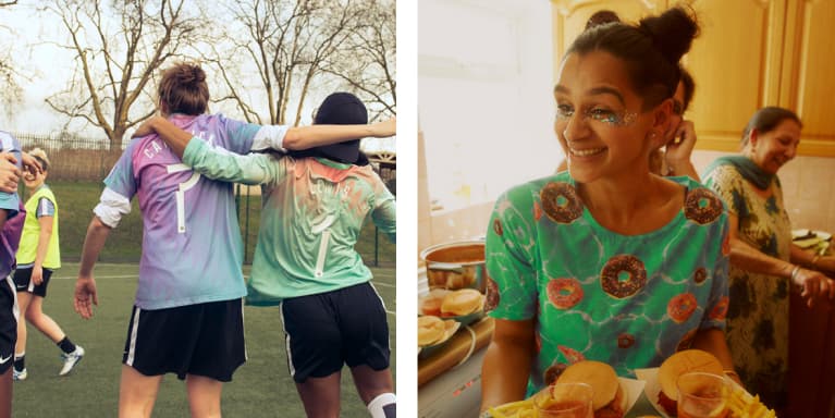
Portraits
One of our most used content areas. We use portrait photography to connect with our customers, by championing people and presenting the emotional benefits of being a Lloyds customer or client.
Pragmatic
We show an eclectic mix of relatable British people.
Optimistic
We look on the bright side to show empowered, confident people.
Charming
We show real lives and genuine moments. That may mean we focus on the fun, quirky or serious sides of the people we photograph.
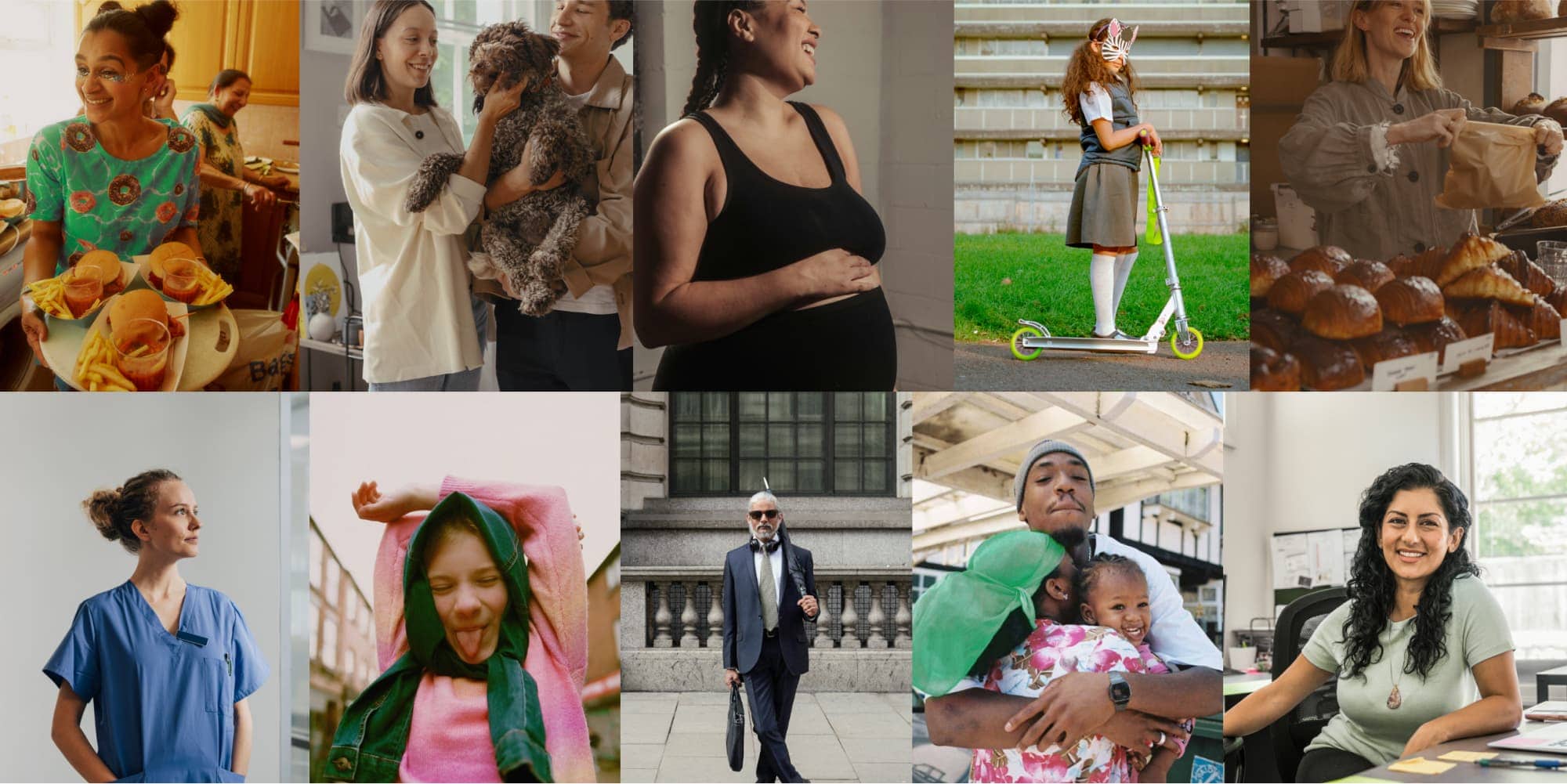
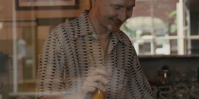
Lifestyle
Lifestyle imagery supports our portrait photography. It enables us to elaborate on specific storytelling. It should be used to support messaging.
Pragmatic
We show situations that feel relatable to people. Whether that’s home life or work life, we keeps things real and unstaged.
Optimistic
We look on the bright side to show empowered, confident people out in the real world.
Charming
We celebrate the charm in everyday situations, looking to raise a smile when the time is right.
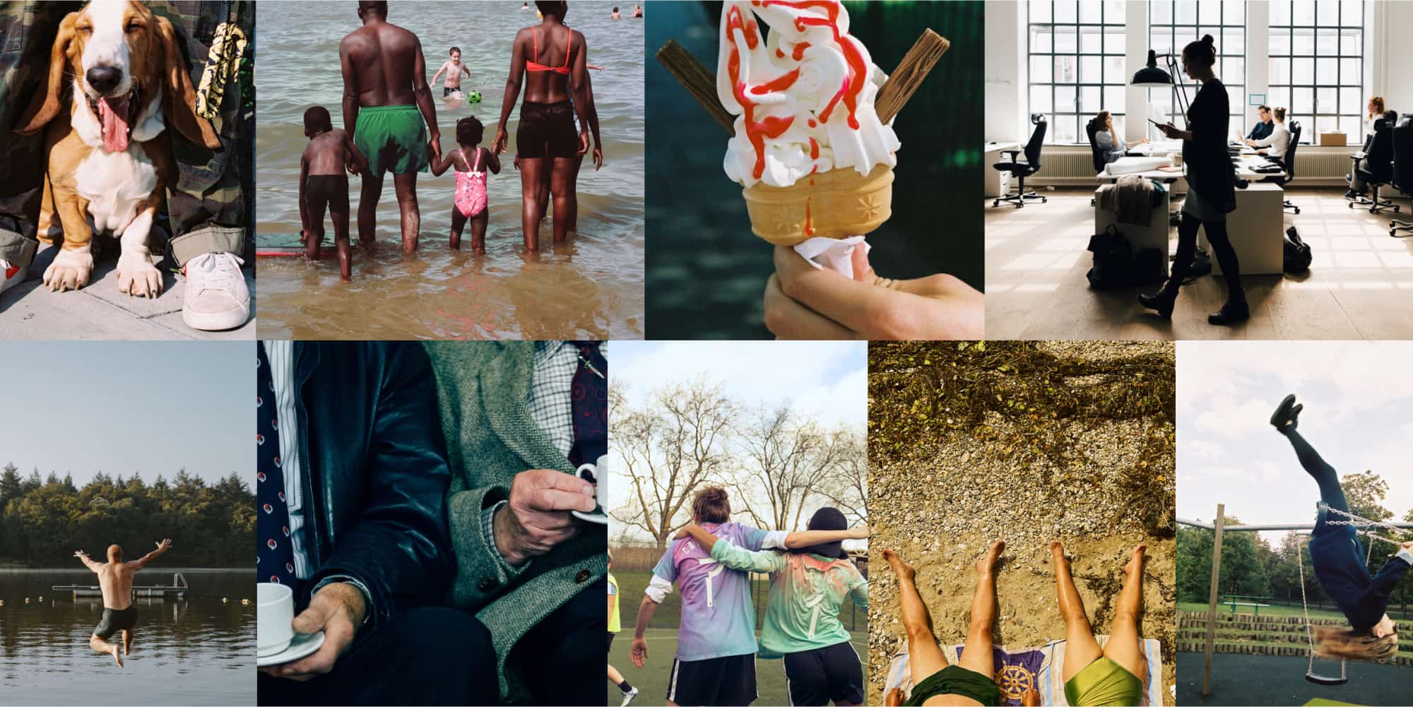
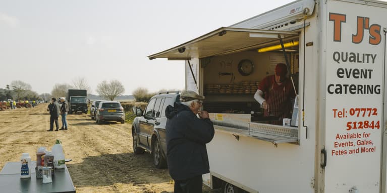
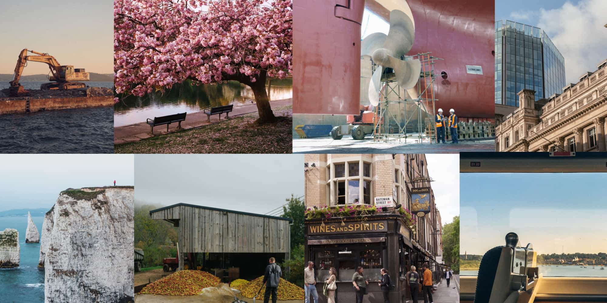
Environments
Environments photography helps us tell more aspirational stories and allows us flex to talk about more sensitive subjects. This photography is used across the brand but mainly for business to connect with international and local audiences.
Pragmatic
We show all sides of the UK, from inner cities to beautiful landscapes.
Optimistic
Whatever the weather, we capture the beauty and wonder of Britain. And, crucially, we’re not elitist about it.
Charming
We show charming and relatable scenes and celebrate the details, quirks and character of environments.
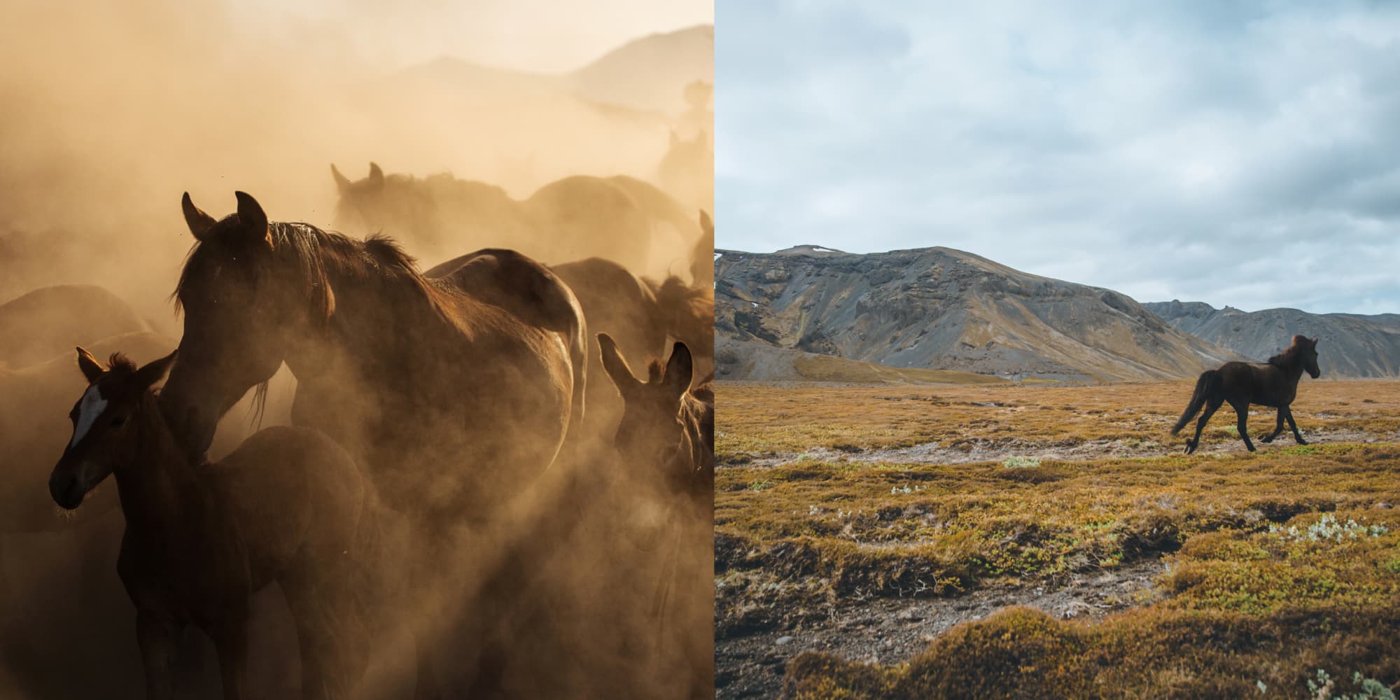
Cancara
Cancara is a wild horse, so we always remember that when photographing or filming. We primarily use Cancara for our emotive, brand-led executions promoting our high-level brand story, e.g. TV and OOH advertising.
We can also use Cancara for signature brand touchpoints and key moments in the customer journey where our customers are interacting with us personally, e.g. mobile app splash screen and branch walls.
Pragmatic
Showing Cancara in the real, down-to-earth Britain we know.
Optimistic
Cancara should always feel powerful, alert and ready to go.
Charming
Cancara should always feel elegant and graceful.
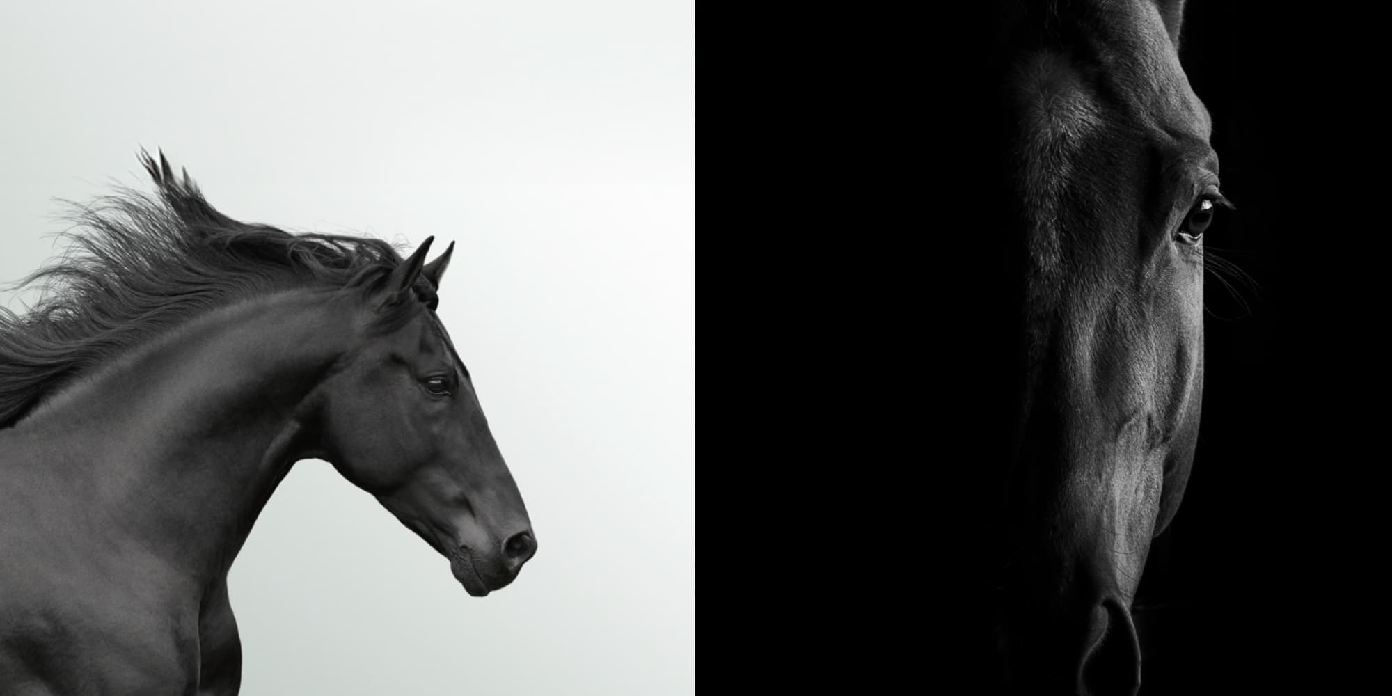
Elegant Cancara
Our elegant Cancara is used to bring a premium feel to our brand. Used rarely we reserve the use for premium or sensitive moments predominantly within Private Banking. Only to be used with the brand team's permission.
Pragmatic
We focus on the beauty of Cancara not the surroundings.
Optimistic
Clear and crisp shots with natural, bright lighting.
Charming
We shoot with dynamic crops, focusing on the details, elegance and beauty of Cancara. Crops should never be cryptic or obscure.
Cancara usage guidance
Our black horse, Cancara, is a wild horse. He’s healthy and strong, with graceful proportions and a healthy sheen. So it’s important we use Cancara with pride and confidence. These tips should help.
Do
- Use Cancara as a hero asset
- Art direction should feel confident and iconic
- Cancara is always spirited and free
- Cancara always moves with purpose and grace
- Always use him with scale and stature
- Ideally, he should move or face left to right
Don't
- Cancara is never as a secondary or supporting asset
- Don’t use low-grade photography, 3D/ render, film or animation
- Cancara shouldn’t be bridled or corralled
- Don’t make Cancara apologetically small, or lost in the landscape
- Don’t show Cancara moving or facing right to left
Illustration
Explain and express... with a smile
Our illustrations are full of personality. They help us to express and to guide — adding optimism and charm to our communications. They help our customers get to grips with information and make complex comms more engaging.
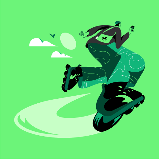
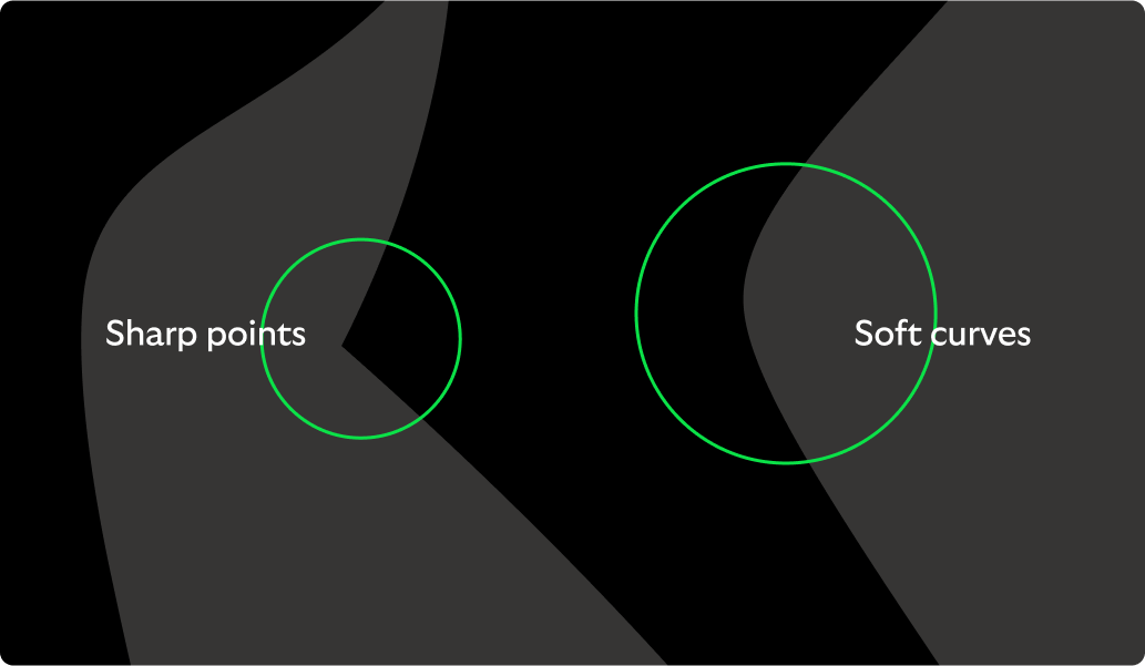
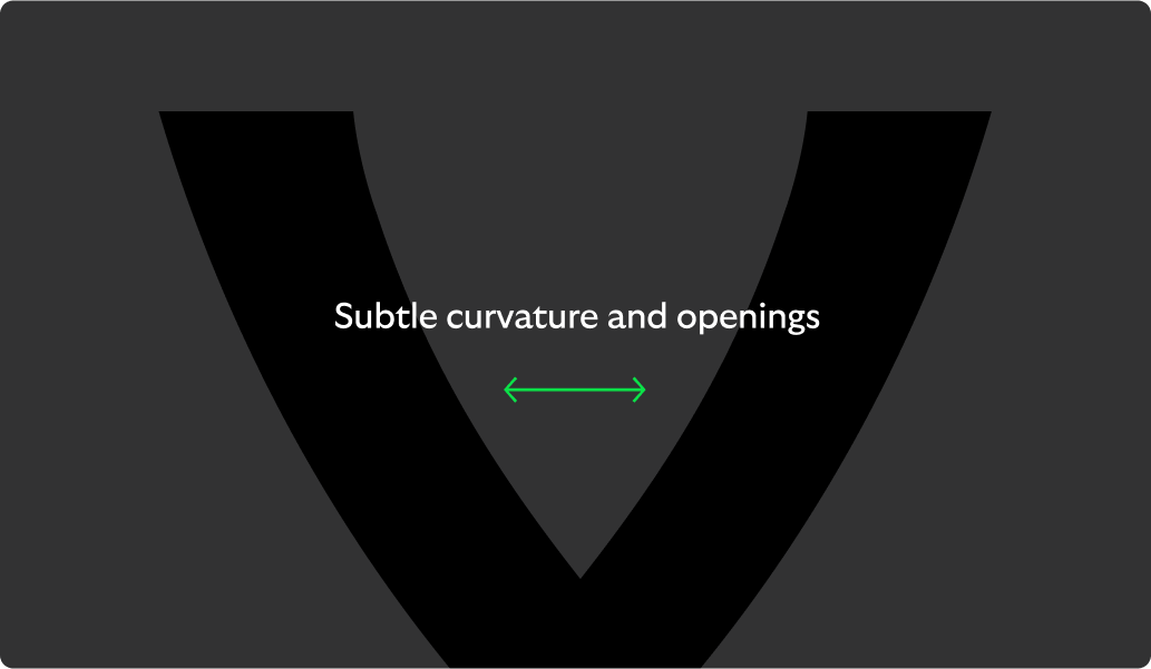
Illustration DNA
Our illustration style is inspired by the design language of our logo, typeface and our Cancara principles.


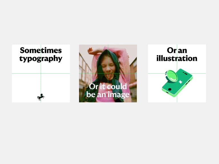
Two styles and their roles
We have two types of illustration: spot and hero. This is how we use them.
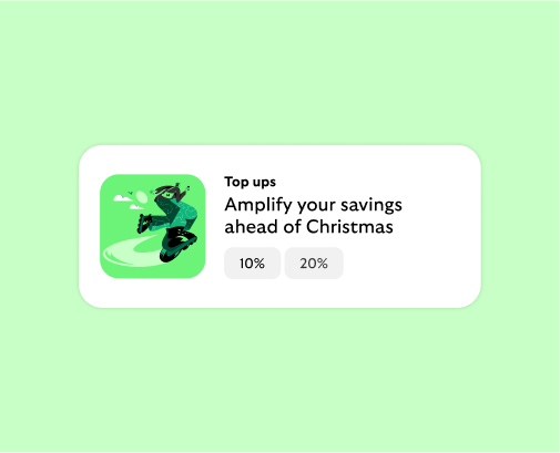
Spot
Character and charm at small sizes.
Hero
Expressive moments at scale.
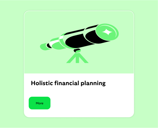
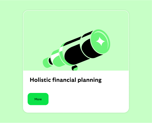
Spot illustrations in use
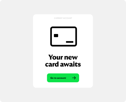
Specifically designed for Lloyds by a specialist illustrator, our spot illustrations add explanation to content with charm and character. Used large in support of a headline or small as a navigation tool to easily identify what you’re looking for.
All illustration are commissioned and managed through the brand team in small batches. The sets will be developed based on metaphors that can be used widely across the business.
Usage
Usage primarily to aid information at size small sizes.
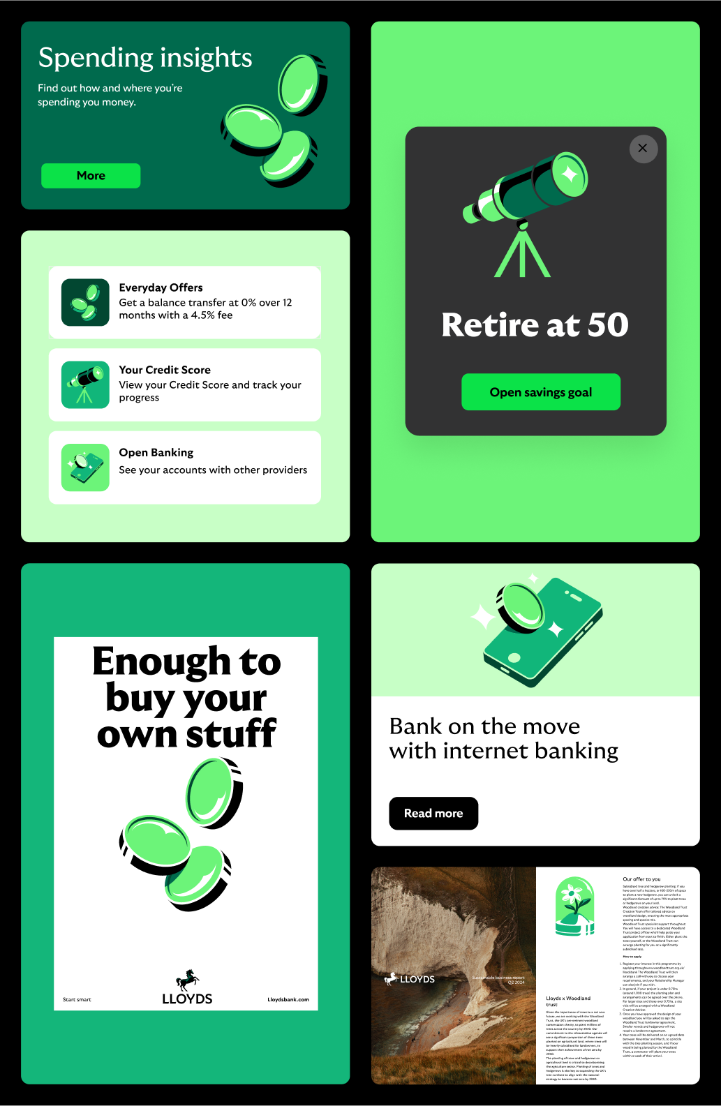
Sizing
Digital: 64px > 256px
Print: 15mm +

Spot illustration colour selection
Our illustrations can be recoloured to work across our different background colours. We always select Core Brand Colours that enhance the reading of the illustration, using the the following four rules as guidance.
Legibility
Choose colours that give good contrast against the background.
Consider the content
Colour should be used to clearly denote sections and enhance the understanding of the illustration.

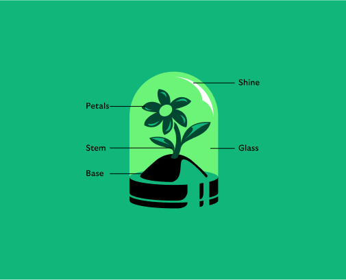
Colour creates depth
Use a range of core brand colours to add depth to the illustration, avoiding flat single tones. In this example we have 7 different brand greens in use.
Monotone on secondaries
When used on secondaries we utilise a black and white colourway to ensure legibility across the palette. The secondary colour is brought through to add depth and detail.

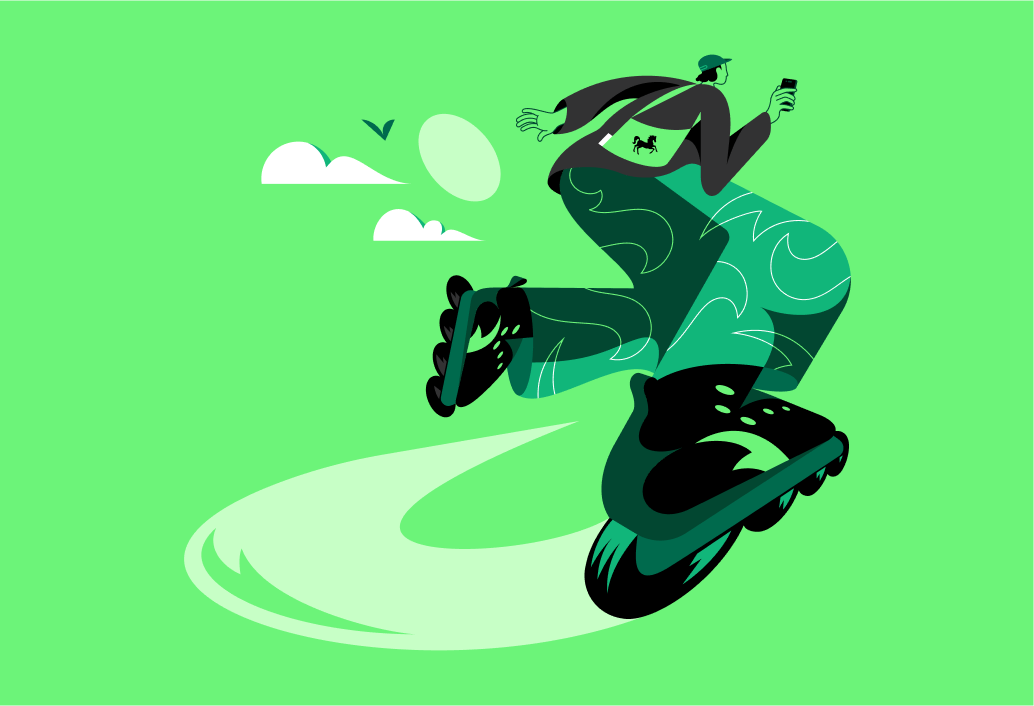
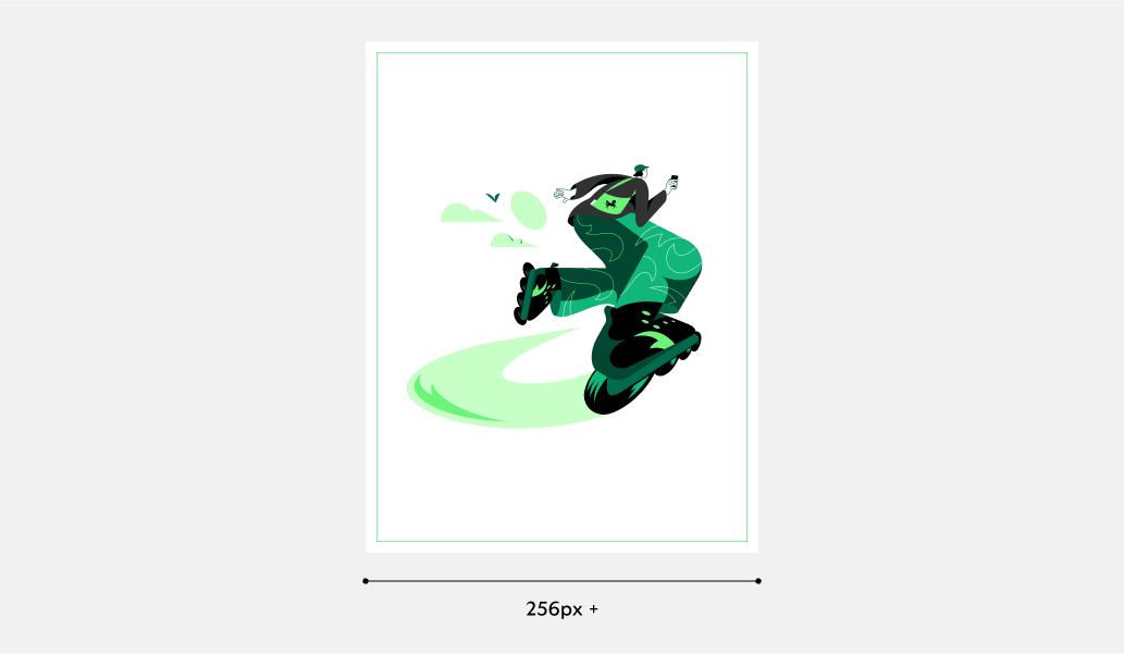
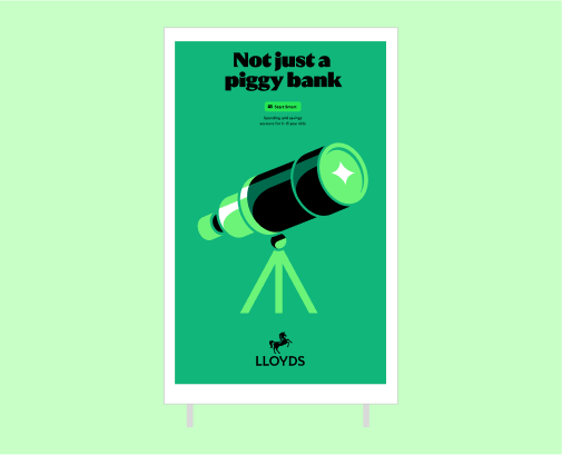
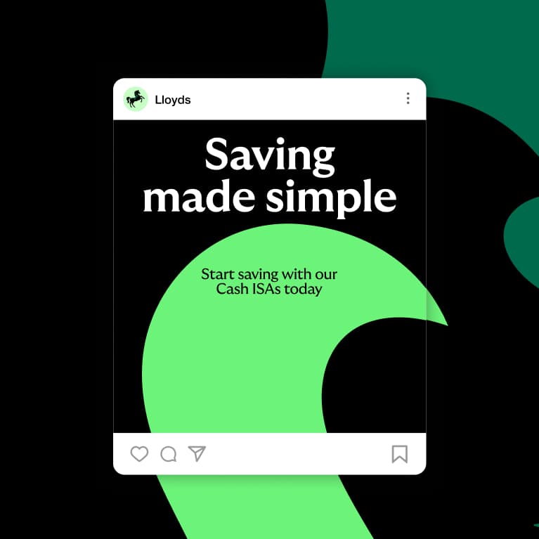
Hero illustrations in use
Specifically designed for Lloyds by a specialist illustrator, our hero illustrations are used large and singularly as the main focal point within the communication. Hero illustrations are designed to be expressive, full of attitude and movement.
Further heroes will need to be created on a brief-by-brief basis by the brand team, with an agreed illustrator, to ensure they feel appropriate to the audience and content and mirror the defined style.
Usage
Used across digital and printed media as campaigns or to support editorial content. Avoid using these too small, we want to see all the details.
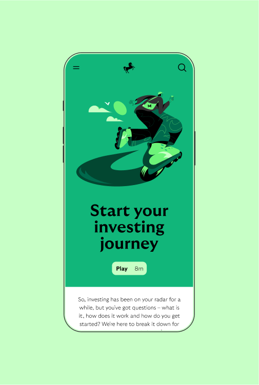
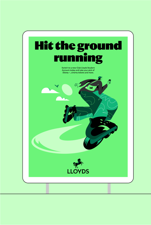
Usage
Always use large where the media allows
Digital: 256px +
Print: 40mm +
What not to do
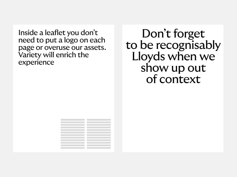
Only use the illustrations as provided and avoid distorting or adapting them. Don’t force the asset into comms, only use when the context and the content is suitable.


Don’t change the colour combinations
Spots should only ever be used as supplied.
Don’t use spots on other backgrounds
Illustration colourways should only be used on the correct background.
Don’t use a hero in place of a spot
Heroes are designed to be used with impact at a larger scale.
Don't use spots as heros
Spots are not designed to be used as the main part of the communication or as campaign lead. They should always be in a supporting role to the content.
Don’t distort illustrations
Only use the illustrations as supplied.
Don’t crop illustrations
Illustrations should always be used uncropped.
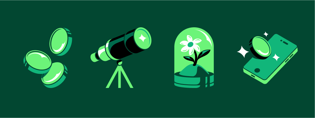
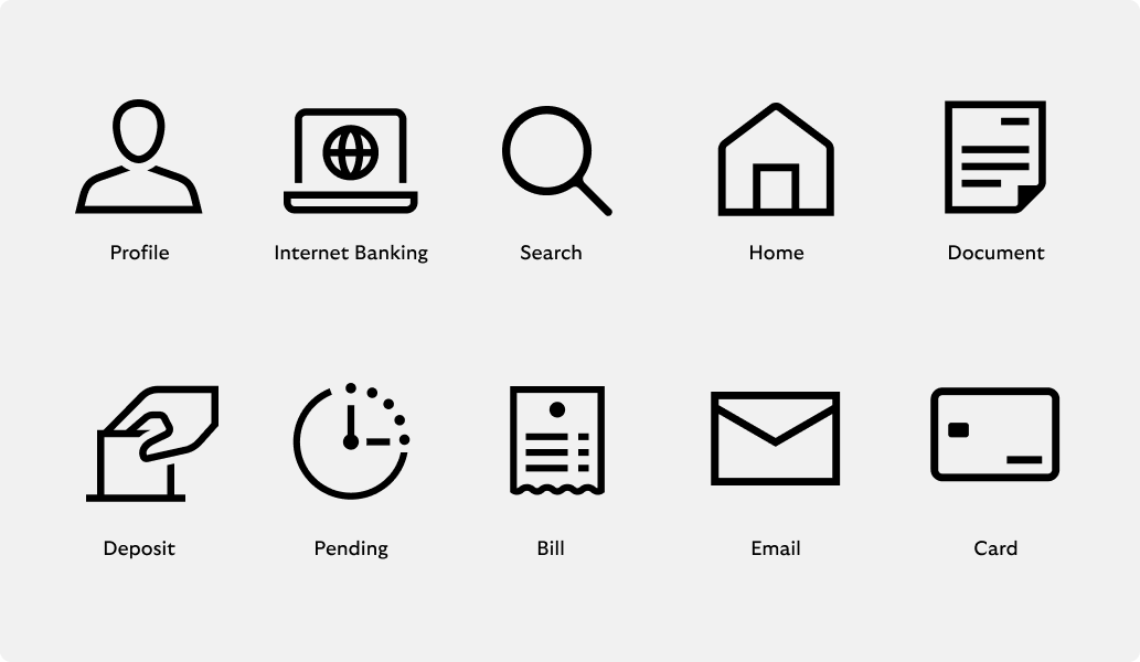
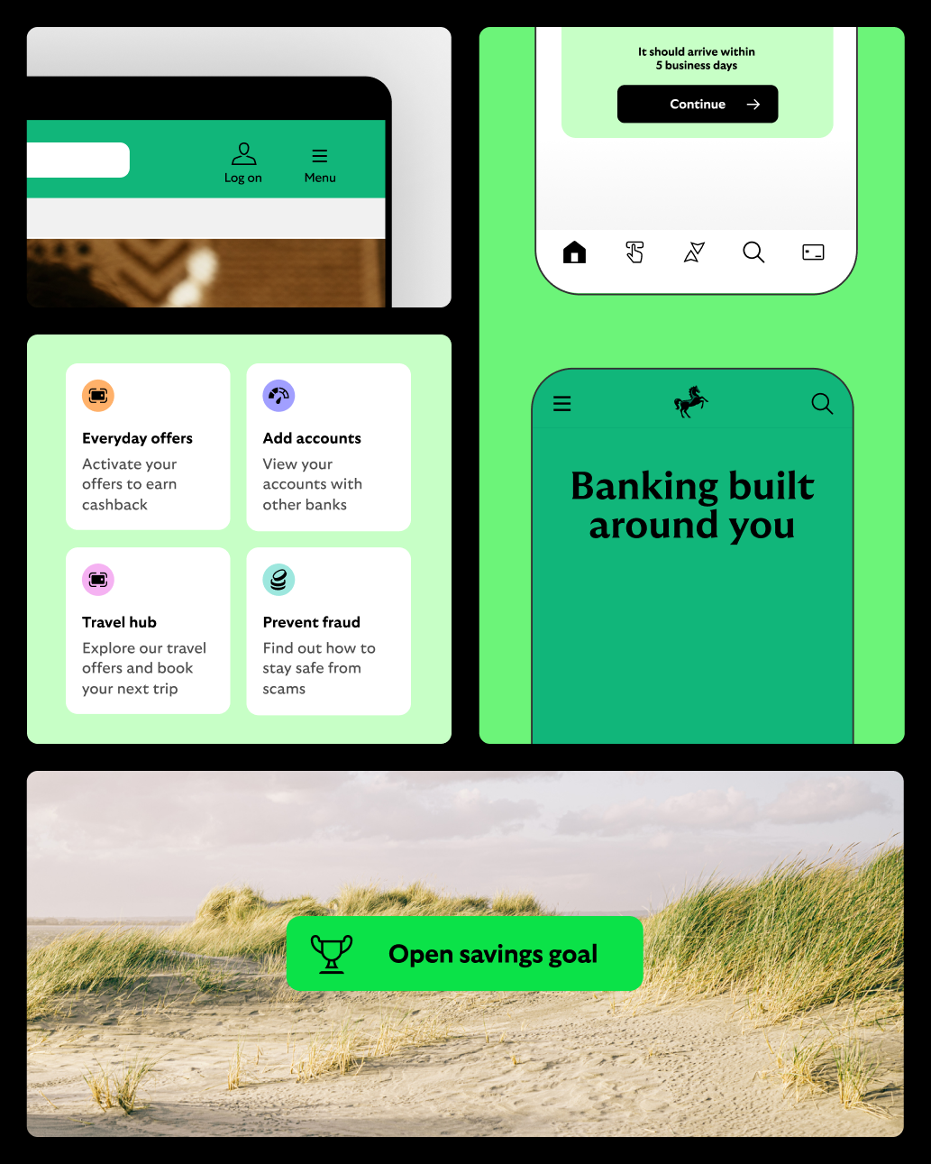
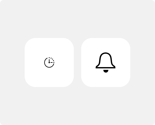
Icons
Functional iconography
Our icons are super pragmatic and hard working. They are clear and easily understood but also use the Cancara DNA to inform their style.
Icon DNA
Our icon style is inspired by the design language of our logo, typeface and our Cancara principles.
Icon context
These are functional icons. That means they should be super clear, not overly-embellished. These icons should give you a sense of the overall style.
All icons are commissioned and managed through the brand team in small batches. Future icons can be developed based on any requirements that are not met through the core set.
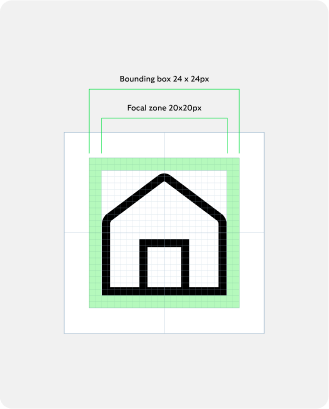
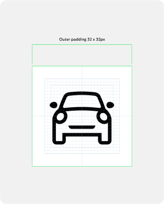
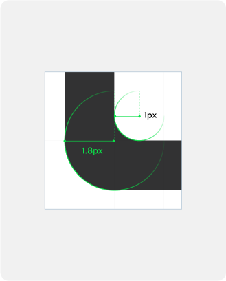
Icon construction
Our iconography is created on a consistent grid and drawn with a consistent line weight and corner diameter.
Focal zone
20px x 20px
Outer padding
32 x 32px
Stroke weight and radius
Inner curve: 1px
Outer curve: 1.8px
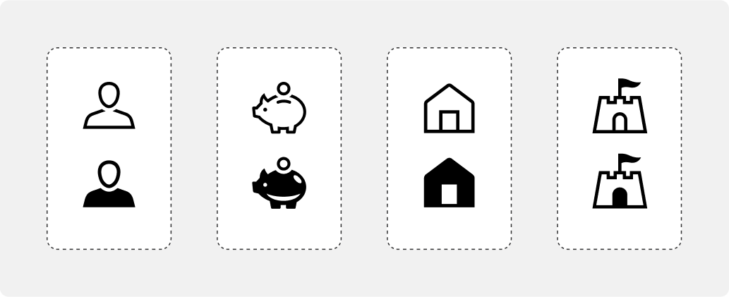
Icon states
We have two states for our icons: active and inactive. Each state clearly signifies to the user where they are in their journey. We also use the semi-filled versions for indicators on promotional and marketing material.
Active and inactive
We use a semi-fill to convey an active state.
Icon colour
We have two colour modes: light mode and dark mode. Only use these colours defined here, they are the most accessible for digital touch points.
Black and White
All icons will only be used in black and white and not in any of the primary or secondary colours.
Colour backgrounds
There is an opportunity to bring colour into the icons with background fills when adding them into a roundel.
Icons in use
What not to do
Don’t make overly complex
Icons should be simple and pragmatic, removing unnecessary detail.
Don’t reduce legibility
Colour should always enhance the legibility of the icon.
Don’t use icons as a hero image
Icons should only be used at smaller sizes and should not be used in place of spots or hero illustrations unless approved by Cancara OS team.
Don’t create new styles
Icons should always follow the same style structure.
Don’t use inconsistently
Always use icons at a consistent size in relation to each other.
Don’t distort
Icons need to be universally recognisable, so never distort or rotate our icons.
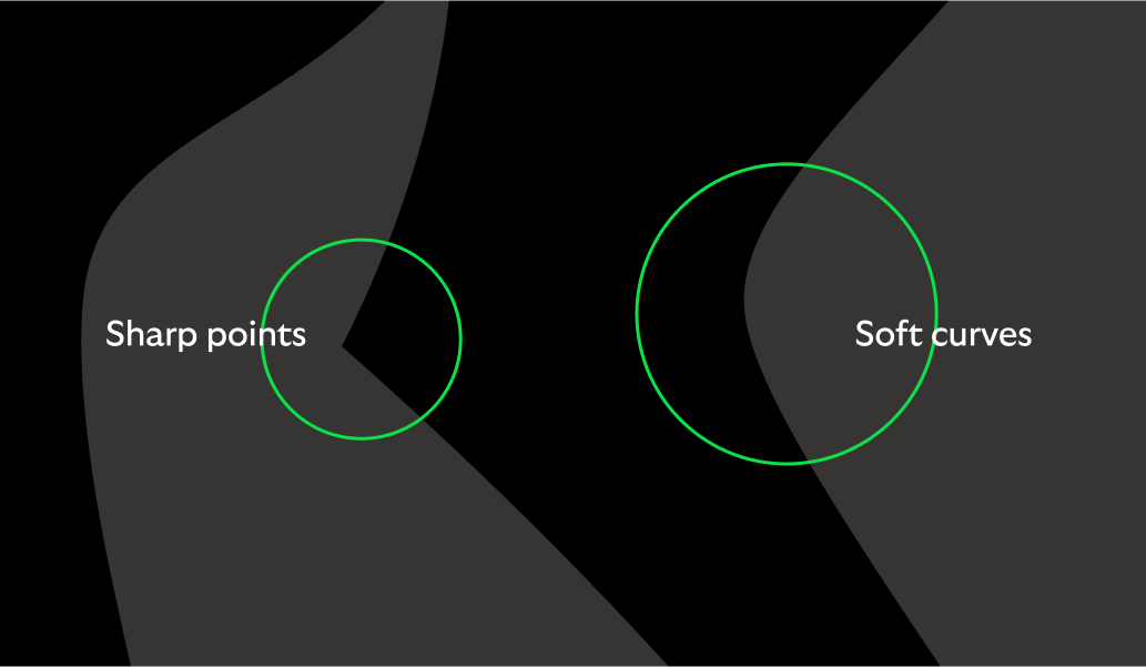
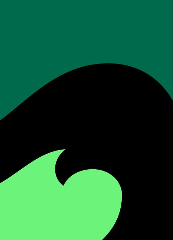
Graphic pattern
Cancara inspired
Our pattern is born from our iconic logo and references traditional British craft and patterning, creating a textural motif that unites the brand.
Our graphic patterns
Our patterns are a great tool for us to add moments of charm, texture and depth to our brand experience, but always in support of, and secondary to, the wider brand expression.


Formats
Each pattern offers a wide landscape that is designed
to be cropped to different sizes and ratios depending
on the format you’re designing to.
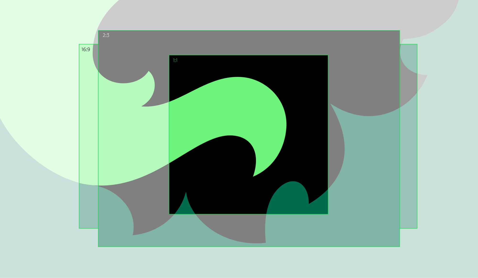
Flexibility
Our patterns are designed to be cropped to different formats.

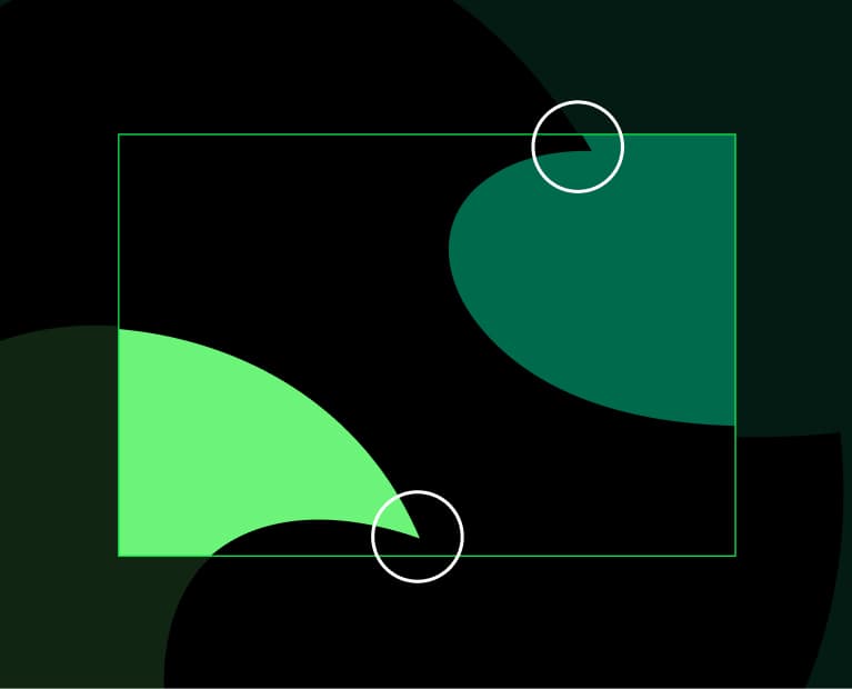
Strong confident shapes
Crop to create simple forms.
Awkward crops
Avoid creating small disjointed forms when cropping.
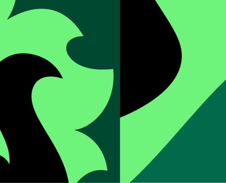
Colour
Colour is used to create different expressions of pattern, from dramatic high contrast to quieter muted combinations. During initial brand rollout we favour our primary colour way but some audiences and contexts will be better suited to a softer tone. Take care not to overuse the secondary colour ways; we want our primary colour way to be the first choice.


Primary colour way
This is the primary use colour way for our patterns. It contrasts core colours that add a bold expressive feel to our brand.
Tonal
Use two similar colours that feel soft and complementary.


Subtle
For subtle moments or when we want to add texture to materials in our environments.
Sophisticated
Dark tones that feel confidently understated.
What not to do
Our patterns should always be used to enhance the branded experience not dominate or distract.

Don’t use with sensitive content
We don't use pattern in comms when dealing with sensitive content.
Don’t use in all secondary colours
We don’t use bright secondary colours in our pattern.

Don’t use multiple patterns together
Our patterns should be used singularly and with confidence.
Don’t use awkward crops
Take care to avoid creating small disjointed forms when cropping.

Don’t be inaccessible
Ensure all text is accessible on our graphic pattern.
Don’t make the curves too complex
Our patterns should always feel harmonious and intentional.

Copyright © Lloyds Banking Group 2026