History of Cancara
Get to know Cancara, the iconic horse at the heart of Lloyds Bank, by the nation’s side since 1677.
Introduction
Get to know Cancara, the iconic black horse that's been at the heart of Lloyds Bank and by the nation’s side since 1677.
The evolution of the Cancara logo from 1860 to 2013.
The black horse symbol
The history of the use of the black horse symbol can be traced back to 1677 when it was used by goldsmith Humphrey Stokes in front of his shop on Lombard Street in the City of London. During the 17th century, there were no street numbers as most people couldn’t read, so businessmen used decorative signs in front of their stores to attract attention and provide a means of identification.
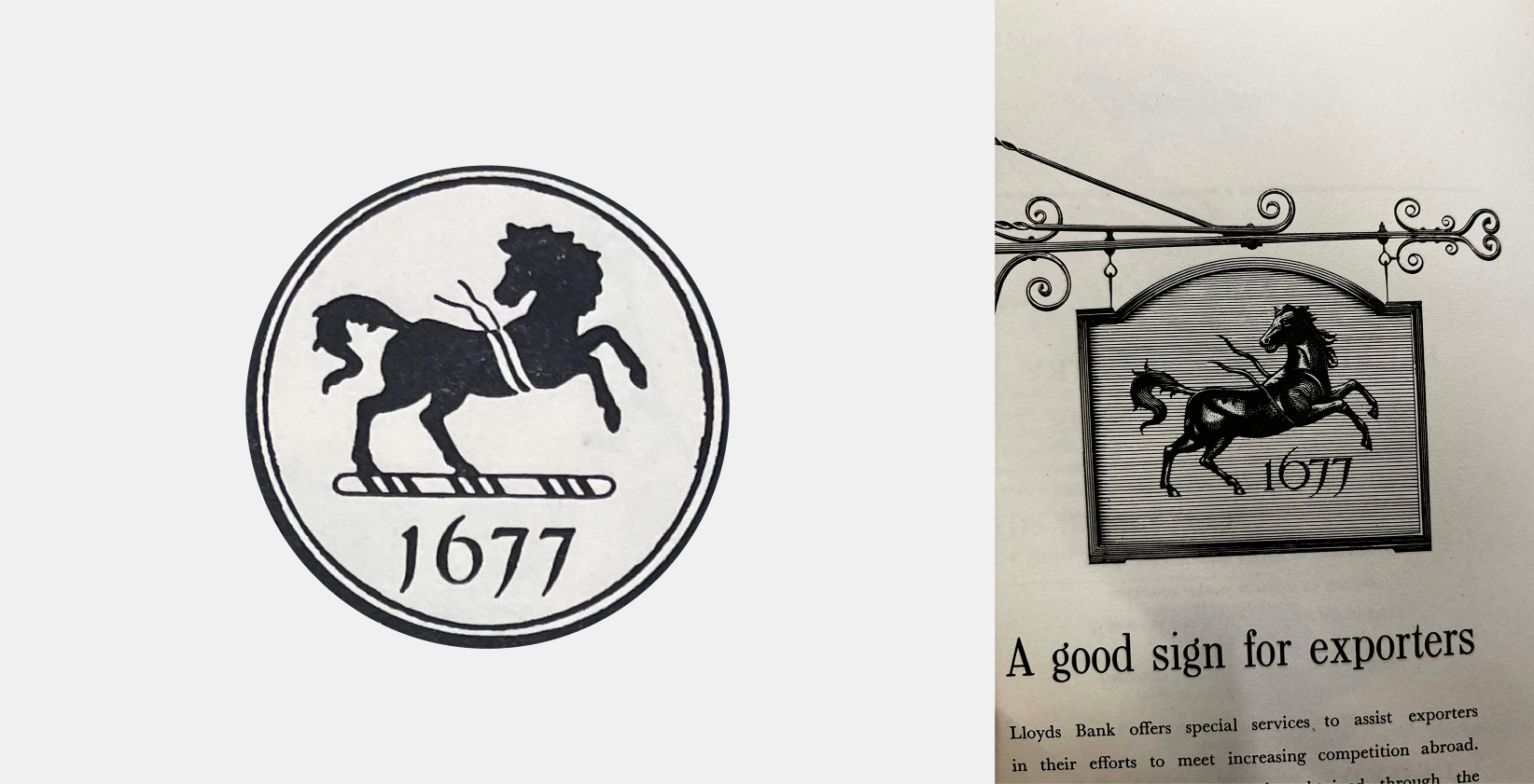
One of the first uses of Cancara in 1677 boldly displayed outside a goldsmith shop to represent trust and reliability.
By 1728, the symbol belonged to another goldsmith called John Bland. Goldsmiths were the forerunners of modern financial institutions. People left their valuables and surplus gold coin with goldsmiths for safekeeping in exchange for a receipt, which became a negotiable instrument, like a banknote. These receipts could be handed on to others to settle debts, saving time and effort as well as being much safer than the actual transfer of money. Bland’s banking business continued to grow and underwent many changes of partnership, meaning that by the time Lloyds Banking Company of Birmingham took it over in 1884 it was called Barnetts, Hoares, Hanbury and Lloyds.
This takeover was the one that joined Lloyds to the black horse.
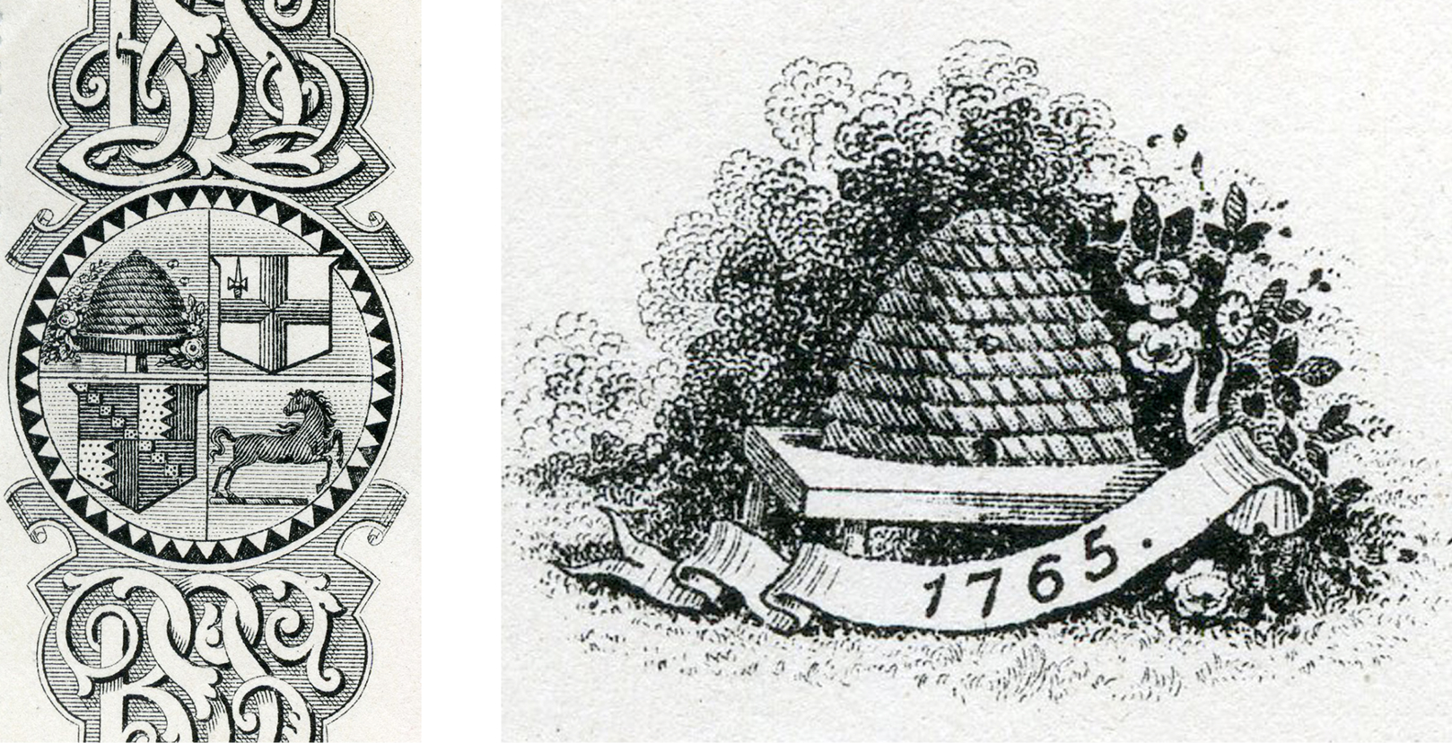
The original beehive symbol (right) and later including Cancara featuring on cheques in 1889 (left).
Prior to this, Lloyds had been using a beehive as symbol, which was meant to symbolise “thrift and industry”. We introduced the beehive in 1822 when a highway robbery of some banknotes prompted the bank’s partners to add it to their notes to make them more distinctive. Following the takeover of Barnetts, Hoares, Hanbury and Lloyds, the beehive and the horse ran alongside one another for about 40 years until the 1920s when the horse, with its longer, more prestigious history and connection with the City of London became the favoured symbol of the bank.
It was used prominently in promotional and advertising campaigns and played a huge part in raising brand awareness internationally.
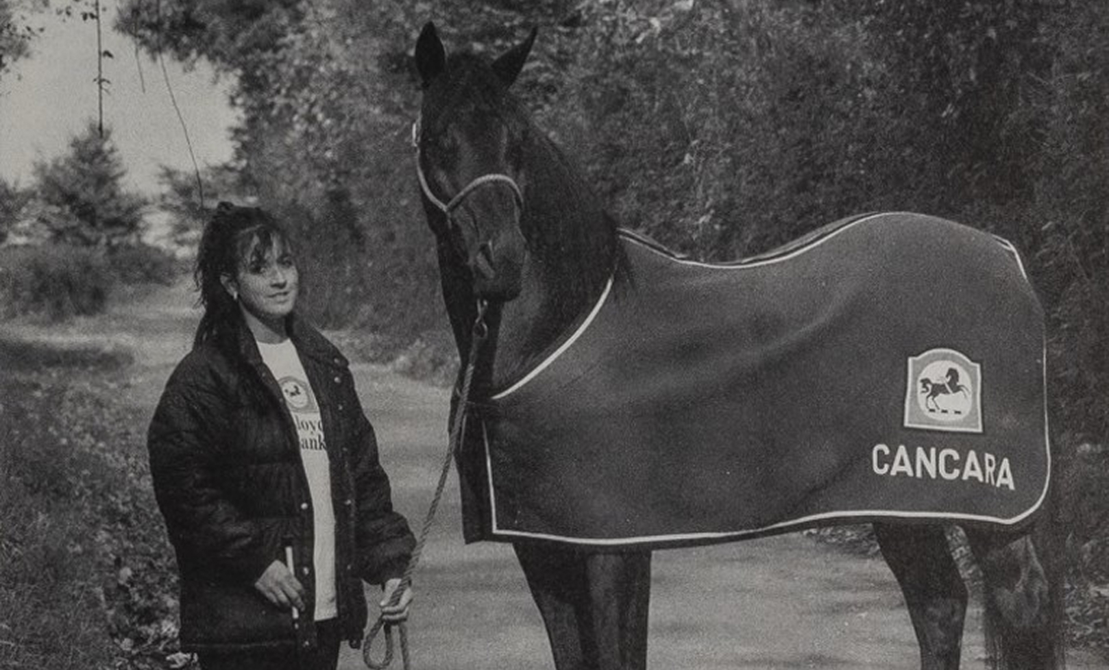
Cancara with owner Laura Parker in a 1994 issue of Lloyds Bank News.
Cancara the horse
In 1989 Downlands Cancara the horse was selected from a shortlist of six to represent Lloyds Bank in its latest campaign. He went on to become an extremely powerful advertising image and was even voted “Horse and Pony” magazine’s most popular horse in Britain in 1994. He also had his own “Horse and Pony” fan club.
Standing at 16 hands one inch, Cancara was a Graded Trakenher Stallion, a German breed. His great-great-grandfather Pythagoras made the trek from East Prussia to the UK. During the 1980s, Verity Parker, a colleague at Portsmouth branch of Lloyds Bank, saw Cancara at a Hampshire stud farm and fell in love.
Unfortunately Verity died from cancer a few years later and her husband Graham purchased Cancara to honour her memory. It was unexpected by Graham that Cancara would be selected to represent Verity’s old employer many years later.
Immortalised in the form of a Royal Doulton statuette
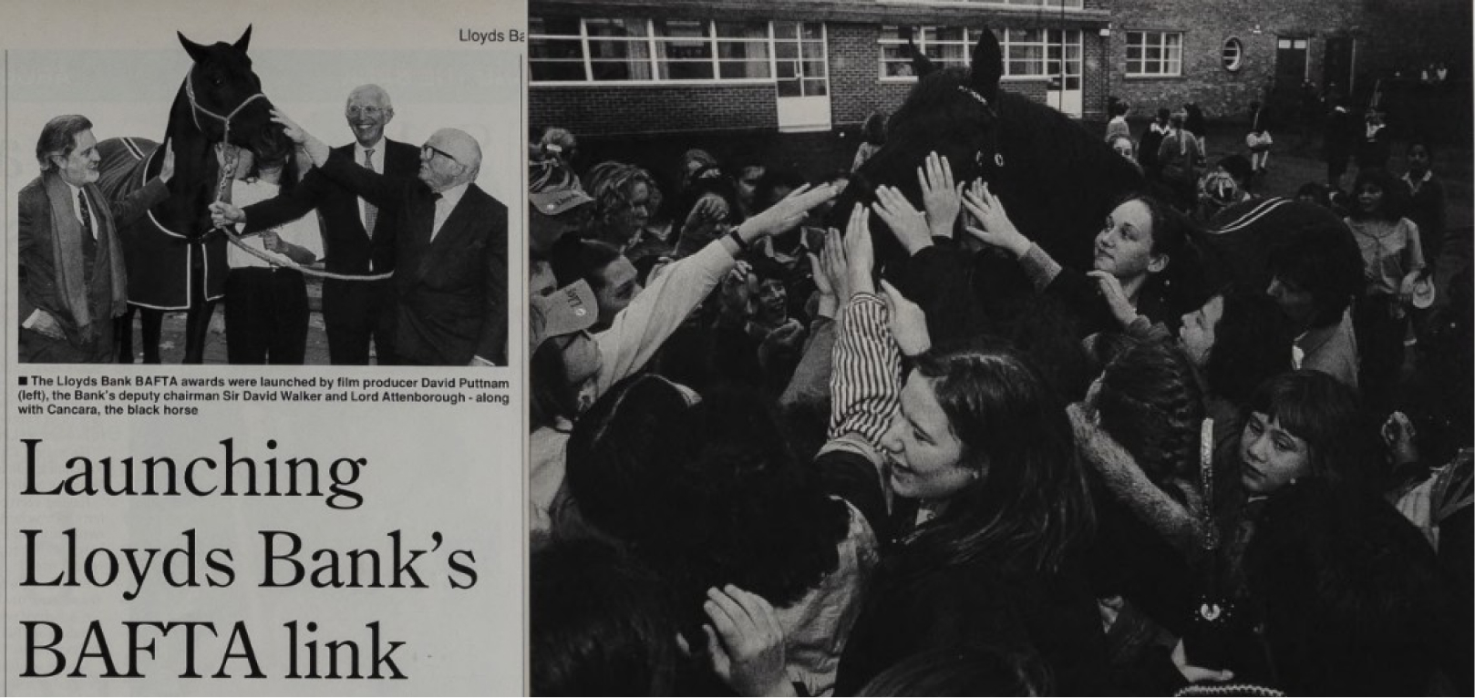
Cancara at the Lloyds Bank BAFTA awards with The Group’s deputy chairmen in 1993 (left) and making a popular appearance at Scholing Girls School in 1991 (right).
Cancara starred in the very popular Thoroughbred Banking and Legendary Service series of ads throughout the 90s and had a very busy schedule of public appearances (roughly three a week during May-October every year). He had a huge pulling power, and helped raise over £100,000 for charities every year. He joined the pantheon of “great horses” when he was immortalised in the form of a Royal Doulton statuette.
Cancara appeared in his last TV advert in 1996, but continued to make public appearances until the early 2000s. He retired officially in 2002 and died at the age of 29 in 2007. He is always remembered throughout our records as calm and patient with a love of Polo sweets. But also with the “explosive power to gallop into people’s imaginations”.
Redrawing an icon
For over two centuries, the Lloyds logo featured its iconic black horse in a traditional regardant pose, looking backward, a symbol of heritage and trust. But with the brand’s new positioning, “Lloyds Moves Everyone Forward,” that stance felt out of step with our ambition.
The horse was redrawn to face forward for the first time in our history. This bold evolution marked a defining moment: after more than 200 years, Lloyds embraced a new pose that celebrates momentum and optimism, giving rise to Cancara.
The evolution of the Cancara logo from 1860 to 2013.
Through the rebrand, Cancara was ready for a refresh. The logo needed to set the tone for the brand system. From the curves and chisels of the new typeface, to the subtleties of iconography. A specialist illustrator was commissioned to craft a logo that embraced Lloyds’ bold new visual identity while staying true to the natural elegance of a wild stallion. To stay authentic, Wolff Olins partnered with an equine expert, refining the semiotics and stylised anatomy of Cancara so the horse could feel dynamic, interactive, and deeply integrated into the brand experience.
A specialist illustrator crafted a logo that blended the bold new visual identity with the elegance of a wild stallion
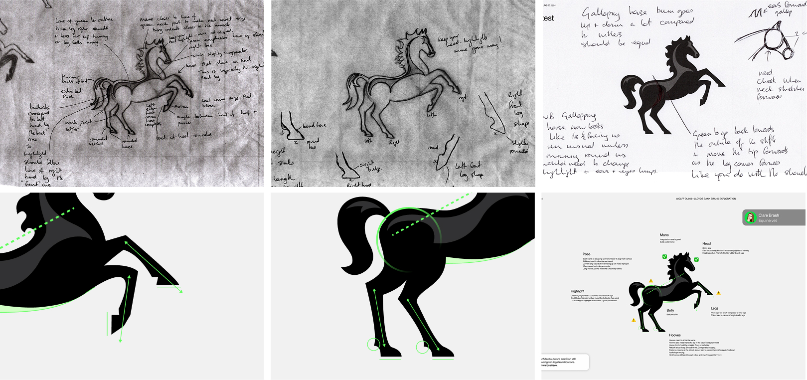
A detailed look into the redrawing of Cancara to match the bold new visual identity.
Marking the foundations of a visual system
Everything in the foundation set is inspired by Cancara. Motion behaviours inspired by classic equine movements now animate key moments across customer journeys, bringing life and energy to interactions and transactions, and beyond.
The evolution of Cancara represents more than a logo redesign. It’s a bold statement of intent. By reimagining the iconic horse to face forward and integrating it seamlessly into a dynamic visual system, we’ve transformed a historic symbol into a modern expression of confidence and progress. Every detail, from anatomical precision to motion behaviours, reinforces our brand promise to move people forward.
The Cancara philosophy
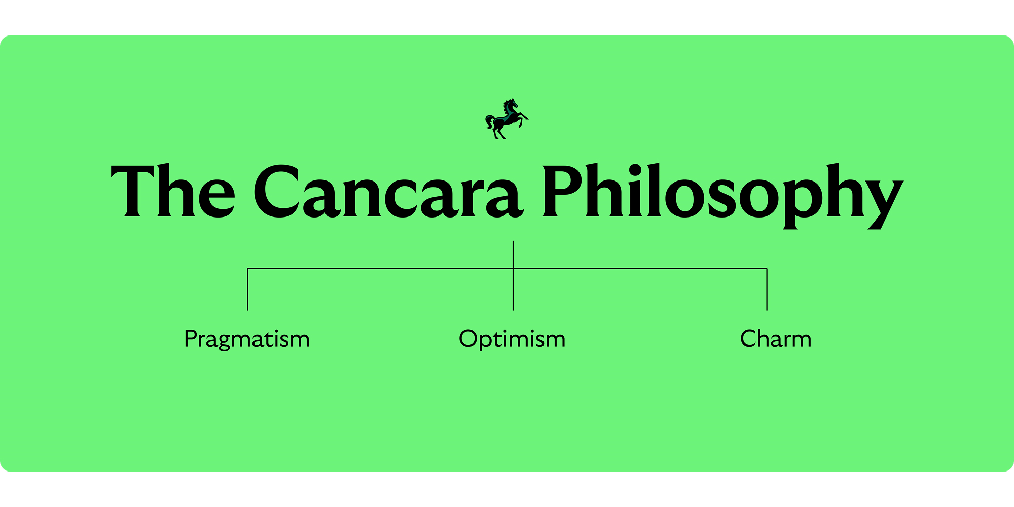
Not only has Cancara inspired the new visual identity, but the brand-verbal identity too. The newly created ‘Cancara Philosophy’ runs through everything we do. Blending beautifully both visual and content design to create experiences that are unlike no other.
The new tone of voice rooted in the new Cancara Philosophy of pragmatism, optimism and charm through linguistic choices as a brand, means the Cancara Philosophy reaches everyone through our experience-led lens.
This philosophy is not just about aesthetics, it’s about ensuring that every interaction embodies the values and emotions Lloyds now stands for.

Copyright © Lloyds Banking Group 2026